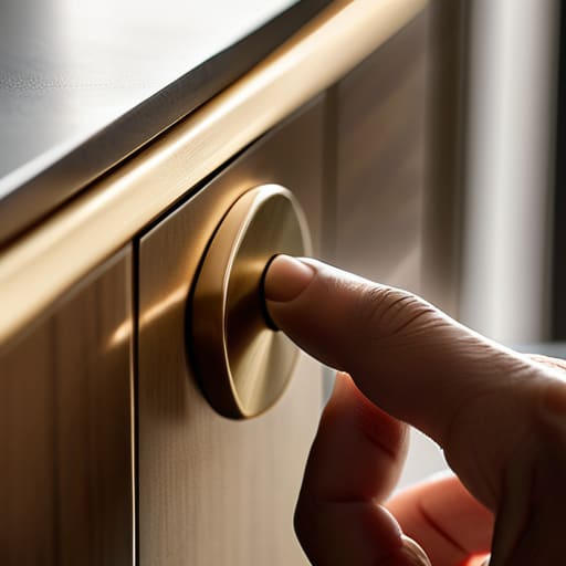
Designing Something Hands Touch Daily
I have a box in the corner of my studio filled with what I call “the ghosts”—brass castings and turned wood scraps that failed to make the cut. Most design textbooks will tell you that how to design a handle or pull is a matter of calculating ergonomics or following golden ratios, but they’re selling you a sanitized version of the truth. They ignore the fact that a handle is the only part of a piece of furniture that actually talks back to you. I remember a sideboard I built in my second year; I spent weeks obsessing over a sleek, minimalist bar, only to realize the moment I touched it that it felt utterly lifeless. It wasn’t a math problem; it was a failure of intuition.
I’m not here to give you a lecture on theoretical aesthetics or expensive CAD software. Instead, I want to talk about the friction, the weight, and the split-second decisions that separate a functional grip from a tactile experience. We are going to look at the real constraints of material and hand, focusing on the choices that actually define an object. My goal is to help you navigate those narrow margins where a design either finds its soul or remains just another piece of hardware.
The Tension of the Grip How to Design a Handle or Pull
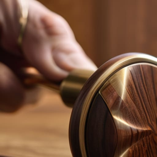
When I sit down with a block of milled walnut or a casting of solid brass, I’m not just thinking about the silhouette. I’m thinking about the hand. There is a specific, almost violent tension between what looks good in a CAD drawing and how a human finger actually seeks purchase. I often find myself leaning on anthropometric data for handle sizing to keep things grounded, but the numbers only take you so far. You can follow the charts to the letter and still end up with a piece of hardware that feels “correct” but entirely lifeless.
The real work happens in the micro-adjustments. I spent most of last Tuesday staring at a prototype for a new series of pulls, obsessing over the radius of the underside. If the curve is too shallow, it feels clinical; too deep, and it feels like a heavy-handed gesture. It’s about finding that sweet spot of tactile feedback in product design where the object communicates its purpose before you even apply pressure. I nearly settled on a sharp, geometric edge for the latest collection, but the prototype sits in my “reject” bin now—it was too honest, and frankly, it lacked the grace a hand deserves.
The Near Miss Curve Applying Industrial Design Principles for Hardware
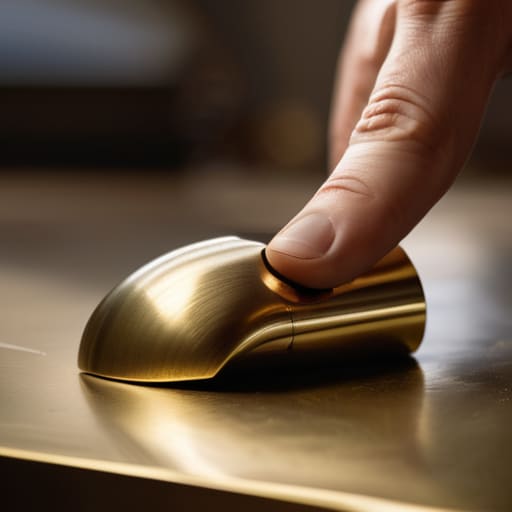
I have a drawer in my studio filled with brass scraps and CNC-milled samples that represent what I call the “safe” decisions. They are technically perfect, following every textbook rule of anthropometric data for handle sizing, yet they feel utterly lifeless. When I’m working on a new series, I find myself constantly fighting the urge to settle for a geometry that is easy to manufacture. It’s tempting to let the machine dictate the radius, but a handle shouldn’t just be a lever; it’s a point of contact that requires a specific kind of tactile feedback in product design.
The real work lies in the friction between utility and soul. You can look up all the industrial design principles for hardware you want, but those charts won’t tell you how a thumb rests against a tapered edge or how a certain weight shifts the perception of a whole cabinet. I often find that the most successful pulls are the ones where I pushed the material to its limit, choosing a profile that felt slightly unsettling before it finally clicked into something intuitive.
Anatomy of a Touch User Interface Ergonomics for Physical Objects
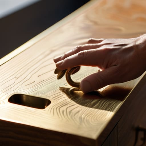
I have a drawer in my studio filled with brass pulls that look exquisite but feel like a mistake. They are beautiful, certainly, but they fail the most basic test of human interaction. When we talk about user interface ergonomics for physical objects, we aren’t just discussing the mechanics of a lever; we are discussing the silent dialogue between a hand and a surface. I’ve learned through years of prototyping that a handle can be mathematically perfect according to anthropometric data for handle sizing, yet still feel utterly alien if it doesn’t respect the natural sweep of a thumb or the pressure of a fingertip.
It is a delicate balance between the visual weight of the hardware and the physical reality of the grip. I often find myself obsessing over the subtle nuances of tactile feedback in product design—the way a certain weight tells the user a drawer is substantial, or how a slight texture prevents a slip. If the interface feels “off,” the user subconsciously blames the entire piece of furniture, not just the hardware. A handle shouldn’t just be a way to open something; it should be the first honest handshake between the person and the object.
The Weight of Choice Material Selection for Cabinet Pulls
I have a drawer in my studio filled with brass samples that I ultimately rejected. Some were too heavy, making a simple cabinet door feel like a chore; others were so lightweight they felt like cheap plastic, despite being solid metal. This is the silent struggle of material selection for cabinet pulls. You aren’t just choosing a finish; you are choosing the physics of the interaction. I once spent a week trying to justify a sand-cast bronze for a minimalist kitchen line, only to realize the sheer mass of the piece would fight against the lightness of the cabinetry. It was a beautiful mistake, but a mistake nonetheless.
The goal is to achieve a specific kind of tactile feedback in product design that tells the user the object is substantial without being cumbersome. If the material is too cold, the connection feels clinical; too warm, and it loses its architectural edge. It’s a delicate calibration between how a piece looks in a catalog and how it feels when your hand meets it at 7:00 AM on a Tuesday.
Precision in the Palm Using Anthropometric Data for Handle Sizing
I have a drawer in my studio filled with brass extrusions that are technically perfect but feel entirely wrong. They follow every rule of anthropometric data for handle sizing, yet they lack any sense of soul. We often fall into the trap of designing for the “average” hand, treating the human palm like a static measurement on a spreadsheet. But a hand is a living, shifting thing. If you design a pull based solely on the mean width of a fifth percentile female or a ninety-fifth percentile male, you often end up with something that satisfies neither. You create a mathematical compromise that feels strangely clinical when actually gripped.
True precision comes from understanding how much space a hand needs to maneuver, not just how much surface area it covers. It is about the clearance between the finger and the cabinet face, ensuring that the user doesn’t feel pinched or restricted. This is where the subtle nuances of user interface ergonomics for physical objects actually manifest; it’s the difference between a pull that feels like an extension of the hand and one that feels like an obstacle. I’ve learned that the most successful hardware doesn’t just fit the hand—it anticipates the movement.
The Ghost of a Sensation Masterful Tactile Feedback in Product Design
There is a specific kind of failure that doesn’t show up in a CAD model or a stress test. It’s the failure of feeling—that hollow, plastic click or the way a metal pull feels strangely “thin” despite its actual mass. I have a drawer in my studio filled with pulls that look perfect on paper but feel like lies when you actually use them. This is where tactile feedback in product design moves from a technical requirement to something almost spiritual. It’s the difference between a door that merely opens and a door that announces its presence with a deliberate, dampened weight.
When I’m working on the aesthetic integration of hardware, I’m constantly thinking about the ghost of the sensation that remains after the hand has let go. If a handle is too slick, the user feels a sense of uncertainty; if it’s too textured, it feels aggressive. You are searching for that middle ground where the object feels like an extension of the hand rather than a foreign tool. It’s about the subtle resistance, the way the temperature of the brass meets the skin, and that tiny, almost imperceptible moment of contact that tells the brain the task is complete.
The Unseen Connection Achieving Aesthetic Integration of Hardware
There is a particular kind of failure in a room where the hardware looks like it was invited to a party it wasn’t actually part of. I’ve seen it a hundred times in my twenty years—a beautifully crafted walnut sideboard paired with a brushed nickel pull that feels aggressive, almost loud. It’s a failure of aesthetic integration of hardware, where the object performs its function perfectly but fails to speak the same language as the surface it inhabits. You aren’t just choosing a way to open a drawer; you are deciding how much of the furniture’s soul the handle is allowed to borrow.
I have a drawer in my studio filled with pulls that were technically “correct” according to every textbook on industrial design principles for hardware, yet they felt like intruders. They had the right dimensions and the right finish, but they lacked the visual quietness required to let the grain of the wood breathe. To achieve true integration, you have to stop looking at the handle as a standalone component and start seeing it as a punctuation mark in a larger sentence. If the punctuation is too heavy, the whole sentence loses its meaning.
The Anatomy of a Near-Miss
A handle isn’t just a way to open a door; it’s a negotiation between the hand and the object. I often look at my shelf of rejected prototypes—the ones that were too aggressive, too slim, or too precious—and realize that a successful design isn’t found in the perfect curve, but in the specific tension of the choice that almost went the wrong way.
Jonathan Marin
The Final Iteration
Designing a handle isn’t about finding a pretty shape to bolt onto a drawer; it is a relentless negotiation between the hand and the object. We have looked at everything from the cold math of anthropometrics and ergonomic curves to the subtle, almost invisible weight of material selection. It is a process of balancing the tactile feedback of a well-machined edge against the visual quietude required for aesthetic integration. Ultimately, a successful pull is a series of solved problems—decisions made about grip, scale, and texture that allow the user to interact with their environment without a single moment of cognitive friction.
I often look back at the scrap pile in the corner of my studio, at the brass pulls that were too sharp or the wooden grips that felt too hollow. Each one represents a path not taken, a mistake that taught me more than the successful prototype ever could. When you sit down to design your next piece of hardware, don’t just aim for something that looks right in a catalog. Aim for that moment of perfect, quiet utility where the object disappears into the movement. Remember that the most profound design isn’t found in the grand gesture, but in the deliberate choice to favor the subtle truth of a curve over the easy safety of a straight line.
