
A Family of Pieces With One Language
I was staring at a stack of rejected walnut chair legs in my studio last Tuesday—each one marked with a sharpie note about a failed taper or an aggressive curve—when it hit me how much we misinterpret the concept of a collection. Most design textbooks treat the transition from a single object to a suite as a mere exercise in repetition, as if you can just take one chair and slightly shorten the legs to create a stool. It’s a hollow way to work. If you’re looking for a mathematical formula on how to design a series rather than one piece, you’re looking in the wrong place; a real series isn’t about sameness, it’s about the shared tension between different forms.
I’m not here to give you a lecture on brand consistency or aesthetic cohesion. Instead, I want to talk about the friction that occurs when you try to make different objects speak the same language without losing their individual voices. I’ll be sharing what I’ve learned from twenty years of moving between custom studio work and mass production: how to find the connective tissue in your work by leaning into the decisions that almost went the other way.
The Ghost of the Alternative Why Single Assets Fail
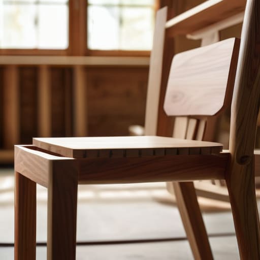
I have a shelf in the back of my studio, tucked behind the walnut offcuts, filled with what I call “the ghosts.” These are the chairs that almost were—the ones where I pulled a thread too far or, more often, where I played it too safe. When you focus solely on a single asset, you’re essentially designing in a vacuum. You solve for a specific moment, a specific user, a specific light. But a single object is a monologue; it doesn’t know how to listen to what comes next.
The failure of the standalone piece usually reveals itself when you try to expand. You realize you haven’t built a language, just a sentence. Without a foundation of thematic continuity in design, the second piece always feels like an intruder, a stranger trying to pass for a relative. This is where most people stumble into the trap of mere repetition. They think they are designing collections, but they are actually just making more of the same. True strength comes from designing collections vs single assets by establishing a set of rules—a shared DNA—that allows each new piece to breathe while still belonging to the same family.
How to Design a Series Rather Than One Piece
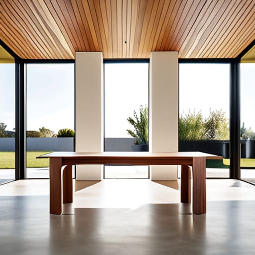
The shift from a single object to a collection requires a change in how you perceive your own rules. When I’m working on a solitary chair, I can afford to be idiosyncratic, almost temperamental. But once you move into designing collections vs single assets, those idiosyncrasies have to become a shared language. You aren’t just looking for things that match; you are looking for the underlying logic that allows a table and a stool to sit in the same room without shouting over one another. It’s about establishing a set of constraints—a shared DNA—that governs the proportions or the joinery across the entire line.
This is where thematic continuity in design becomes your most practical tool rather than just a lofty concept. It’s not about repeating the same leg shape three times; that’s just a template, and it’s boring. Instead, it’s about finding a consistent way to handle a transition, like how a curve meets a flat plane, and applying that logic across different scales. You are building a system, not a list. If the logic is sound, the series will feel inevitable, even if every individual piece is doing something slightly different.
The Tension of Thematic Continuity in Design
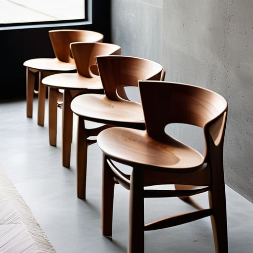
The mistake I see most often—the one that haunts my studio floor—is the attempt to force a connection through mimicry. People think thematic continuity in design means using the same leg profile or the same wood species across five different chairs. But that’s not a collection; that’s just a repetitive set. Real continuity lives in the invisible logic that binds them. It’s the shared rhythm of a curve or a specific, stubborn way a joint is handled. When I’m working on a series, I’m not looking for things that match; I’m looking for things that belong to the same conversation.
This is where the friction becomes useful. If you lean too hard into creating brand consistency, you end up with a sterile, predictable line that lacks any soul. You want to find that sweet spot where the pieces feel like they emerged from the same workshop, even if they look nothing alike. It’s about designing for scalability without losing the specific, jagged edges that make a single object interesting. You have to allow for enough variation so that each piece can stand alone, while maintaining a subtle, underlying tension that pulls them back into a single, coherent family.
Visual Identity Systems Built on Near Miss Decisions
When I look at the shelf in my studio, filled with those rejected prototypes, I don’t see failures; I see the DNA of a successful system. Building visual identity systems isn’t about finding a single, perfect shape and repeating it like a stencil. That’s just manufacturing, not designing. Real cohesion comes from the friction between variations. If you design a chair, then a table, then a lamp, the link shouldn’t be a literal copy of a leg or a joint. Instead, it should be the echo of a specific tension—a particular angle or a weight distribution—that you almost discarded during the first iteration.
This is where the real work of designing collections vs single assets lies. You aren’t just looking for a way to make things match; you are looking for the common thread of “almost.” When I’m working with modular design principles, I find that the most robust systems are built on the decisions that were nearly overruled. By leaning into those near-misses, you create a sense of intentionality that feels organic rather than forced. It’s the difference between a set of items that look like they belong together and a collection that feels like it grew from the same soil.
Designing Collections vs Single Assets the Pivot Point
When I’m sitting at my drafting table, the temptation is always to solve the immediate problem—to make this one chair sit correctly or this one table hold weight. That is the trap of the single asset. You solve for the moment, but you fail to solve for the future. Designing collections vs single assets isn’t about making things that look like they belong to the same family; it’s about establishing a shared logic that survives the introduction of new variables. It’s the difference between a solo performance and a recurring motif in a symphony.
The real pivot point happens when you stop thinking about the object and start thinking about the rules that govern it. This is where designing for scalability becomes a physical reality rather than a corporate buzzword. I look at my shelf of rejected prototypes and realize that the successful ones weren’t just “good” designs; they were the ones that left enough breathing room for a second or third piece to exist alongside them. You aren’t just building a product; you are building a framework of constraints that allows for variety without sacrificing the soul of the work.
Modular Design Principles and the Beauty of Constraints
I’ve spent a good portion of my career staring at a pile of rejected chair legs in the corner of my studio, wondering if the slight taper I discarded would have actually saved the silhouette. That’s the thing about modular design principles: they aren’t just about making things fit together like Lego bricks; they are about defining the boundaries of what could exist. When I’m working on a new line, I try to build a grammar of parts rather than a single sentence. You aren’t just building a table; you are establishing a set of rules—a specific radius on a corner or a particular ratio of leg to surface—that allows for designing for scalability without losing the soul of the original concept.
The trap is trying to make every piece look identical. Real thematic continuity in design doesn’t come from repetition, but from a shared DNA of constraints. If I decide that every piece in a collection must respect a certain joinery logic, I’ve created a framework that allows for variation. It’s the tension between the rule and the exception that makes a series feel alive. You want the user to feel that even though the sideboard and the stool are different objects, they were born from the same set of difficult, intentional choices.
Designing for Scalability Through Strategic Inconsistency
When we talk about designing for scalability, the instinct is to tighten the screws until everything is perfectly uniform. We crave a mathematical predictability, a way to ensure that item fifty looks exactly like item one. But in my studio, I’ve learned that true scalability isn’t about replication; it’s about managing the drift. If you build a series that is too rigid, you aren’t designing a collection—you’re just manufacturing a repetitive loop. The real strength of a robust visual identity system lies in its ability to absorb a bit of chaos without losing its soul.
I’ve found that the most successful expansions happen when you allow for strategic inconsistency. This means setting a core set of constraints—perhaps a specific joint detail or a particular wood grain orientation—but leaving enough breathing room for the individual piece to breathe. It is the difference between a set of identical chairs and a family of seating that feels like it grew from the same soil. You want to create a sense of thematic continuity in design that feels inevitable rather than forced, allowing each new addition to feel like a logical, yet surprising, evolution of the original idea.
The Weight of the Unchosen Path
A single object is a monologue, but a series is a conversation. If you design a collection by simply repeating the same measurements or materials, you haven’t created a series; you’ve just manufactured a set. The real work lies in identifying that one specific, difficult tension—the curve that almost stayed straight or the joint that almost vanished—and letting that same ghost haunt every other piece in the room.
Jonathan Marin
The Weight of the Unmade
Ultimately, designing a series isn’t about finding a single, perfect formula and repeating it until the work feels sterile. It is about managing the friction between continuity and change. We’ve looked at how modularity, strategic inconsistency, and the ghosts of our rejected ideas form the connective tissue of a collection. If you focus too hard on the visual glue, you end up with a set of objects that feel like they were birthed from a factory machine rather than a human hand. The goal is to build a system where each piece feels like it belongs to the same family, yet possesses its own distinct, stubborn reason for existing exactly as it does.
I often look at the pile of rejected prototypes in the corner of my studio—the chairs with the wrong taper, the tables that were too aggressive—and I realize they weren’t mistakes. They were the necessary boundaries that defined the final series. When you sit down to work, don’t just design the object in front of you; design the space where its siblings will eventually live. True design mastery lies in the intentionality of the gaps. It is in those narrow margins, where you chose one path over another, that the soul of a collection is actually born.
