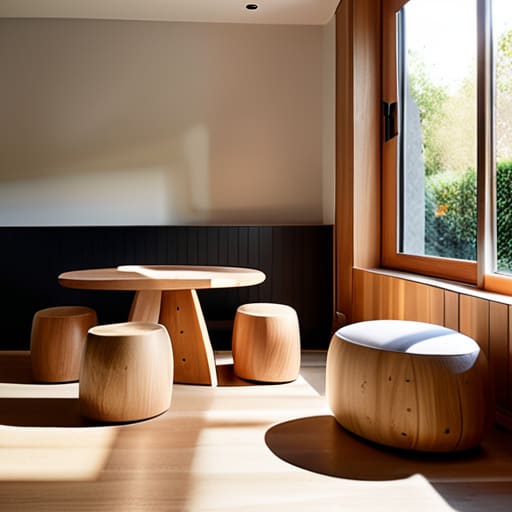
Furniture Children Will Not Break
I was staring at a pile of rejected walnut scraps in my studio last Tuesday, thinking about a chair I built for a client’s toddler five years ago. The industry loves to talk about “developmental milestones” and “ergonomic safety standards” as if designing for kids is some kind of high-level clinical science, but that’s mostly just marketing fluff to justify a higher price tag. When you are actually figuring out how to design something for children, the reality is much messier and far more tactile than any textbook suggests. It’s less about meeting a checklist of colorful, plastic-heavy requirements and more about understanding the brutal honesty of a three-year-old who will find the one structural weakness in your work within ten minutes of play.
I’m not here to give you a lecture on theory or a list of color palettes that appeal to the “youth demographic.” Instead, I want to talk about the actual friction of the process—the moments where a design almost fails because we prioritized aesthetics over the way a small hand actually grips a surface. I’m going to share the lessons I learned the hard way, through the failed prototypes and the near-misses, to help you build things that aren’t just safe, but genuinely enduring.
The Near Miss How to Design Something for Children
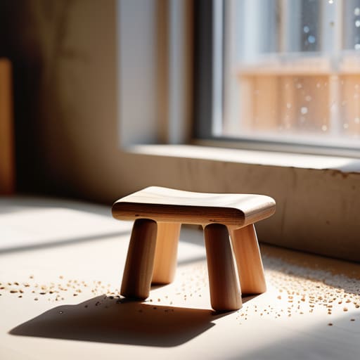
I have a shelf in the back of my studio dedicated to what I call the “almosts.” There is a wooden stool there with a seat that was too deep, and a series of blocks that were just a bit too heavy. When you are working on ergonomic furniture for kids, you realize quickly that you aren’t just designing for a body; you are designing for a moving target. A toddler’s center of gravity is a fickle thing, and what looks stable on a CAD drawing often feels precarious in a living room.
I spent most of last Tuesday staring at a prototype for a small reading chair, caught in a tug-of-war between form and function. I wanted a sleek, minimalist silhouette, but the math kept pulling me toward something much chunkier. I almost went with the slim profile—it looked better in my head—but then I remembered that children don’t inhabit space with grace; they collide with it. I chose the heavier, more grounded base instead. That moment of hesitation, that split second where I almost prioritized my own aesthetic ego over the actual reality of a child’s movement, is where the real design happens.
The Pivot Aligning With Child Development Stages Design
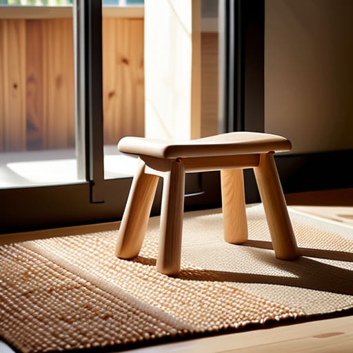
I remember a prototype for a small stool that sat in my “reject” pile for six months. It was structurally perfect, but it failed because I was designing for an idealized version of a child rather than the messy, kinetic reality of one. We often fall into the trap of treating child development stages design as a checklist of milestones, but it’s more of a moving target. A toddler doesn’t just need a seat; they need a sense of stability that compensates for their shifting center of gravity. If you ignore that physical negotiation, you aren’t designing a tool—you’re designing a hazard.
This is where the tension between form and function gets uncomfortable. You start looking at ergonomic furniture for kids not as a way to make things “cute,” but as a way to respect their autonomy. I spent weeks tweaking the radius of a single curve to ensure it felt substantial enough to hold, yet soft enough to forgive a stumble. It’s a delicate balance of providing enough challenge to encourage growth without crossing into frustration. In the end, the most successful pieces are the ones that acknowledge the user’s limitations while quietly supporting their expansion.
The Rejected Curve Why Ergonomic Furniture for Kids Matters
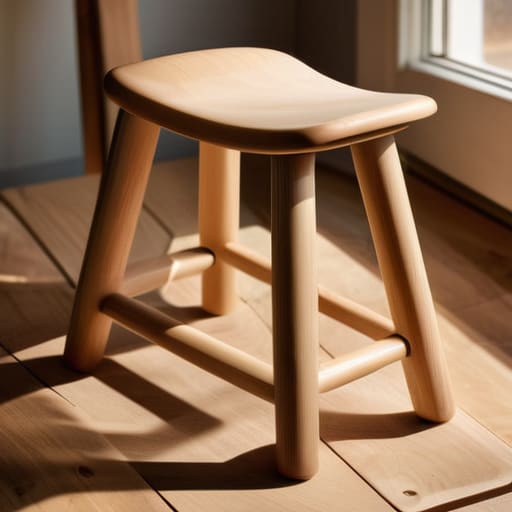
I have a small wooden stool sitting on the bottom shelf of my workshop, tucked behind a stack of letterpress trays. It’s a squat, awkward thing with a radius on the seat that feels almost too aggressive. I rejected it three years ago because the curve was too shallow; it felt like it was trying to be “modern” rather than functional. Looking at it now, it’s a reminder that when we talk about ergonomic furniture for kids, we aren’t just talking about comfort—we are talking about the physical dialogue between a growing body and a static object.
A child’s posture isn’t a miniature version of an adult’s; it’s a moving target. If the seat angle is off by even a few degrees, the child compensates by slouching or leaning, which changes how they interact with their environment. I used to think a simple, flat surface was the safest bet, but the “near-miss” in my process was realizing that stability requires a specific kind of geometry. We have to design for the way they sit, sprawl, and inevitably tip, ensuring the piece supports their movement rather than forcing them into a rigid, adult-centric stillness.
The Material Tension Choosing Non Toxic Materials for Children
I have a shelf in my studio dedicated to “failures,” and it’s currently heavy with samples of finishes that looked beautiful but failed the sniff test. There was a particular walnut oil I wanted to use for a toddler’s activity table—it had this deep, organic warmth that felt essential to the piece. But after a week of testing, the chemical scent lingered too long in my small workspace. I had to scrap the entire idea and pivot to something more inert. When you are working with non-toxic materials for children, you quickly learn that “natural” isn’t a synonym for “safe.” You have to interrogate every binder, every pigment, and every sealant with a level of suspicion that most designers find exhausting.
It’s a constant tug-of-war between the tactile soul of a material and the rigid reality of age-appropriate product safety standards. I once spent an entire afternoon arguing with a supplier about the particulate size of a certain beeswax finish. It felt pedantic at the time, but that’s the job. In my experience, the most successful pieces aren’t just the ones that look right; they are the ones that allow for uninhibited, safe exploration without the designer constantly worrying about what happens when a curious hand meets a surface.
The Sensory Risk Integrating Sensory Play Design Elements
I have a drawer in my studio filled with textured scraps—sandblasted oak, brushed aluminum, and even a piece of heavy-gauge felt. I keep them because, in the context of sensory play design elements, texture is often the first thing a designer abandons in favor of “clean” lines. We tend to design for the eye of the parent rather than the hand of the child. I remember a prototype for a small wooden stool where I initially opted for a high-gloss lacquer finish. It looked impeccable on a CAD drawing, but it felt sterile, almost defensive. I ended up rejecting it because it lacked tactile feedback.
The real work happens when you stop designing for how an object looks on a showroom floor and start thinking about how it feels during a moment of discovery. A child doesn’t just see a chair; they feel the grain of the wood or the slight coolness of a metal joint. It’s a delicate balance to integrate these sensory cues without violating age-appropriate product safety standards. You want a surface that invites a touch, but you can’t let that invitation become a hazard. It’s about finding that sweet spot of friction—where the material is engaging enough to be interesting, but predictable enough to be safe.
The Safety Threshold Navigating Age Appropriate Product Safety Standards
I have a drawer in my studio filled with what I call “the casualties”—pieces of birch and scraps of polymer that failed because they were too ambitious. In the context of children’s products, those failures aren’t just design flaws; they are potential liabilities. When you’re working within age-appropriate product safety standards, you quickly realize that the law is often the floor, not the ceiling. I remember a prototype for a small stool where I wanted a slim, tapered leg to give it a more sophisticated silhouette. It looked beautiful on paper, but it failed the stability test with a single nudge. I had to thicken the profile, sacrificing that elegance for something much more grounded and honest.
It’s a constant negotiation between what looks good and what is fundamentally safe. You find yourself staring at a joint or a fastener, wondering if it can withstand a decade of heavy-handed curiosity. True design in this space isn’t about avoiding the rules, but about integrating them so deeply into the form that the safety features don’t feel like afterthoughts. You aren’t just building a toy or a chair; you’re building a boundary.
The Visual Compromise Balancing Child Friendly Aesthetics and Colors
I have a small wooden stool sitting on the corner of my workbench, a prototype from five years ago that I couldn’t bring myself to toss. It was painted a primary, aggressive red—the kind of color that screams for attention in a playroom but feels utterly jarring in a living room. I rejected it because I realized I was designing for the child’s immediate impulse rather than the home’s long-term reality. This is the central tension in child-friendly aesthetics and colors: the tug-of-war between high-contrast stimulation and the muted, calming palettes that parents actually want to live with.
The temptation is always to lean into the “toy-ification” of an object, using bright hues to signal playfulness. But true design happens in the middle ground. I’ve found that if you use subtle, desaturated tones, you can still respect child development stages design by providing visual interest without creating sensory overload. It’s about finding that sweet spot where a piece of furniture feels like a tool for discovery, rather than a loud, plastic intrusion into a quiet corner of the house.
The Ghost in the Prototype
When I’m designing for a child, I’m not just looking at the finished chair or the final toy; I’m looking at the pile of discarded sketches in the corner. The real design happens in that tension between a shape that looks beautiful in a catalog and a shape that actually survives a three-year-old’s idea of a physics experiment. If you haven’t agonized over a single joint or a specific radius of a curve, you haven’t actually designed anything—you’ve just made a decoration.
Jonathan Marin
The Ghost in the Object
Looking back through the stack of rejected prototypes in my studio—the ones with the edges too sharp, the colors too loud, or the joints that failed a simple tug test—I realize that designing for children isn’t about following a checklist of safety standards or developmental milestones. It is a constant, exhausting negotiation between safety and agency. We have spent this time discussing ergonomics, material toxicity, and sensory engagement, but the real work lies in the friction between those requirements. A successful piece of children’s furniture isn’t just one that meets a regulation; it is one that survives the relentless scrutiny of a toddler’s curiosity while still respecting the constraints of the manufacturing line.
Ultimately, I’ve learned that the best things I’ve ever built weren’t the ones where I had a clear, unshakeable vision from the start. They were the ones born from a moment of profound hesitation—the moment I almost chose the cheaper plastic over the tactile wood, or the moment I nearly smoothed over a texture that actually invited touch. If you find yourself stuck in that gray area of indecision, don’t rush to resolve it. That tension is where the soul of the object lives. Design for them not as if they are fragile beings to be protected, but as active participants in the world. The most meaningful objects are the ones that stand up to their scrutiny.
