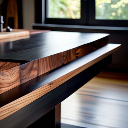
Giving a Heavy Top a Convincing Base
I spent three hours yesterday staring at a pile of rejected walnut scraps in the corner of my studio, thinking about a dining table I built back in ’08. Most design textbooks will try to teach you the geometry of stability or the physics of load-bearing joints, but they completely ignore the psychology of the silhouette. They treat the problem like a math equation, when really, figuring out how to design a base for a top is more about managing the tension between what the eye wants to see and what gravity demands. You can follow every rule in the book and still end up with a piece of furniture that looks like it’s apologising for its own existence.
I’m not here to give you a lecture on structural engineering or sell you on some expensive, over-engineered mounting hardware. Instead, I want to talk about the near-misses—the moments where a base looked too spindly or too aggressive, and how I eventually found the middle ground. I’m going to share the practical, sometimes messy reality of how to design a base for a top by looking at the constraints that actually matter. We’ll focus on the decisions that make a piece feel intentional rather than accidental.
The Great Pivot Learning How to Design a Base for a Top
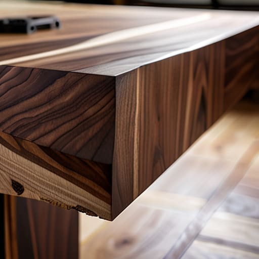
I remember a walnut dining table I was working on back in 2012. I had designed this expansive, cantilevered top that looked like it was floating—purely aesthetic, purely beautiful. But the moment I tried to marry it to a slim, tapered leg system, the whole thing became a liability. I was so focused on the silhouette that I had completely ignored the center of gravity in design. I ended up with a prototype that felt nervous; every time you leaned on it, the entire structure shuddered. It was a lesson in humility.
That failure forced me to stop treating the foundation as an afterthought and start seeing it as the anchor of the entire conversation. You can’t just slap a pedestal under a slab and hope for the best. You have to respect the weight distribution principles that dictate whether a piece feels grounded or precarious. I spent weeks in the shop experimenting with different profiles, realizing that the structural integrity of furniture isn’t just about strength—it’s about how that strength is perceived by the person sitting at the table. It’s about the tension between what the eye sees and what the physics demand.
The Gravity Trap When Weight Distribution Principles Nearly Ruined Everythi
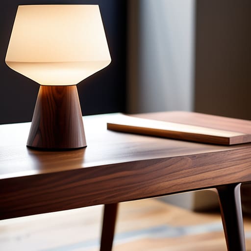
I remember a specific walnut side table from three years ago that sits in my “reject” pile, right next to a lopsided stool. I was obsessed with a minimalist, tapered leg look, convinced that lightness was the ultimate expression of elegance. I spent weeks calculating the load bearing capacity of those thin spindles, thinking I had outsmarted physics. But I hadn’t. I was so focused on the silhouette that I ignored the fundamental reality of the center of gravity in design; the moment a heavy ceramic lamp was placed on the edge, the whole thing became a tipping hazard.
I almost doubled the thickness of the legs to compensate, which would have turned a graceful piece into something clunky and defensive. Instead, I had to rethink the entire foundation. It wasn’t about making the legs stronger; it was about shifting the weight distribution principles entirely. I eventually moved to a recessed plinth base—a decision that felt like a defeat at the time, but it was the only way to preserve the structural integrity of furniture without losing the soul of the piece.
The Near Disaster of Miscalculating the Center of Gravity in Design
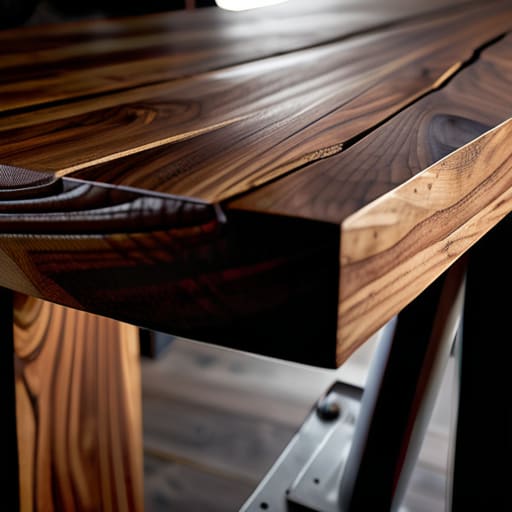
I remember a walnut dining table from five years ago that sits in the corner of my studio, still bearing a handwritten tag: “Unstable—too much ambition.” I had fallen into the classic trap of prioritizing a slim, tapered silhouette over the actual physics of the piece. I was so preoccupied with the aesthetic balance and scale of those spindly legs that I completely ignored the math. I had envisioned a light, airy footprint, but the moment I placed the heavy solid-wood top onto the frame, the whole thing began to lean with a sickening, slow-motion tilt.
It wasn’t just a wobble; it was a fundamental failure of the center of gravity in design. I had placed the support points too close to the central axis, assuming the weight would magically distribute itself. In reality, the leverage exerted by the overhanging edges turned the tabletop into a giant seesaw. I spent three days staring at that failure, realizing that true craftsmanship isn’t about making something look light—it’s about the invisible math that ensures it doesn’t collapse under its own elegance.
Material Selection for Foundations the Choice That Almost Faltered
I spent three days staring at samples of powder-coated steel, convinced that a slim, blackened profile was the only way to maintain the piece’s silhouette. I wanted that airy, almost impossible look where the top seems to hover. But as I sat in my studio, surrounded by the ghosts of failed ideas, I realized I was chasing an aesthetic lie. The steel was too light; it lacked the necessary load bearing capacity to support the solid walnut slab without looking like it was straining under the pressure.
I eventually pivoted to a sand-cast iron, a much more stubborn and heavy material. It was a difficult choice because it fundamentally altered the aesthetic balance and scale of the entire project, making the base feel more grounded—almost aggressive. I have a prototype of that original steel frame tucked away in the corner of my workshop, labeled “Too precious for its own good.” It’s a reminder that true material selection for foundations isn’t about what looks best in a sketch, but about finding the substance that actually earns the right to hold the weight.
The Tension Between Load Bearing Capacity and Pure Elegance
I remember sitting in my studio three years ago, staring at a sketch for a side table that looked like it was floating on nothing. It was beautiful—a slim, tapered silhouette that felt almost weightless. But every time I ran the numbers, the math screamed at me. I was chasing a ghost of elegance, completely ignoring the reality of load bearing capacity. I had designed a top that was far too heavy for the spindly legs I had envisioned, creating a visual lie that would have resulted in a structural catastrophe the moment someone set a heavy book down.
I almost scrapped the whole concept, thinking I’d have to settle for a chunky, utilitarian base just to keep the piece upright. Instead, I spent weeks experimenting with internal steel reinforcements hidden within the timber. It was a frustrating dance between aesthetic balance and scale and the brutal physics of support. In the end, the piece survived, but only because I stopped trying to cheat gravity and started designing with it. The final result looks effortless, but the tension of that struggle is still etched into the joinery.
Aesthetic Balance and Scale the Compromise That Saved the Silhouette
I spent three weeks staring at a prototype for a walnut side table that looked, quite frankly, like it was floating in a way that felt wrong. The top was substantial—thick, live-edge, and heavy—and the base I had initially conceived was a series of spindly, tapered legs that looked elegant on paper but felt utterly disconnected from the mass above. I was so focused on the silhouette that I had neglected the visual weight. It wasn’t just a matter of structural integrity of furniture; it was a matter of psychological comfort. If a piece looks like it might tip if you sneeze, the user will never truly relax around it.
I almost scrapped the entire design to start over with a heavy pedestal, but that would have been a surrender to the easiest solution. Instead, I pivoted to a wider, more grounded tripod arrangement. This allowed me to maintain the aesthetic balance and scale without turning the piece into a heavy, monolithic block. By widening the footprint just slightly, I managed to marry the center of gravity in design with a sense of lightness. It was a delicate compromise: the base finally felt like it was holding the top rather than just struggling to support it.
Defending the Structural Integrity of Furniture Against Impossible Odds
I remember a specific walnut sideboard I was working on three years ago—the one currently sitting in my “graveyard” of prototypes, labeled Too ambitious for its own good. I had obsessed over a slim, tapered leg profile that looked exquisite on paper, but the moment I tried to marry it to the heavy stone top, the whole thing felt precarious. I was fighting a losing battle against the structural integrity of furniture; the legs were beautiful, but they were fundamentally dishonest about the physics of the piece.
I spent a week staring at that assembly, caught between the desire for a floating silhouette and the reality of gravity. I nearly settled for thickening the legs to a point where they lost their grace, effectively killing the design to save the function. Instead, I had to go back to the drawing board and rethink the internal bracing. It wasn’t about making the legs stronger, but about redistributing the load through a hidden steel sub-frame. It was a messy, unglamorous fix, but it was the only way to respect both the material and the laws of physics.
## The Ghost in the Joint
A base isn’t just a support system; it’s a series of concessions. You spend weeks chasing a silhouette that feels weightless, only to realize that the soul of the piece lives in the heavy, ugly, structural decision you almost didn’t make.
Jonathan Marin
The Ghost in the Machine
Looking back at the mess of sketches and the failed prototypes gathering dust in the corner of my studio, the lesson is clear: a base is never just a support system. It is a series of hard-won negotiations between the physics of gravity and the stubbornness of an aesthetic vision. We’ve walked through the pitfalls of miscalculating center of gravity, the heavy hand of material selection, and that constant, exhausting tug-of-war between structural necessity and pure, unadulterated elegance. Designing a base isn’t about finding a perfect solution; it’s about navigating the tension until the piece finally feels like it belongs to itself, rather than just sitting on top of a pedestal.
Ultimately, I’ve learned that the most successful pieces are the ones that carry the weight of their own contradictions. When you finally sit down with a finished object, don’t just look at the lines that worked; look for the ghost of the decision that almost broke it. The strength of a foundation lies in those narrow escapes—the moments where you chose the heavy slab over the flimsy circle, or the complex joint over the easy fix. Design isn’t found in the absence of struggle, but in the deliberate choice to honor the constraint.
