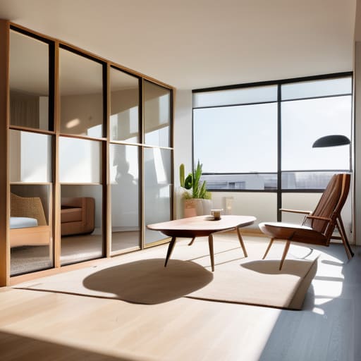
Furniture That Does Not Fill a Room
I have a shelf in my studio dedicated entirely to the “failures”—the chair legs that were too thick, the joints that bit too deep, and the prototypes that simply didn’t work. Most design blogs treat small spaces like a math problem to be solved with “space-saving hacks” or clever mirrors, but that’s a lie. They sell you the idea that you can cheat physics with enough white paint and light-colored veneer. When people ask me how to design for a small room, they expect a list of multifunctional furniture, but they rarely talk about the psychological weight of an object. A single, well-proportioned chair can make a room feel vast, while a dozen “smart” folding stools can make it feel like a cluttered storage unit.
I’m not here to give you a catalog of trendy gadgets. Instead, I want to talk about the geometry of restraint. I’ll share what I’ve learned from two decades of sketching layouts and watching how light actually hits a corner, focusing on the decisions that define a space more than the furniture itself. We are going to look at how to choose pieces that breathe, how to manage visual noise, and why the most important part of a small room is often the empty space you decide to leave alone.
The Crucial Pivot How to Design for a Small Room
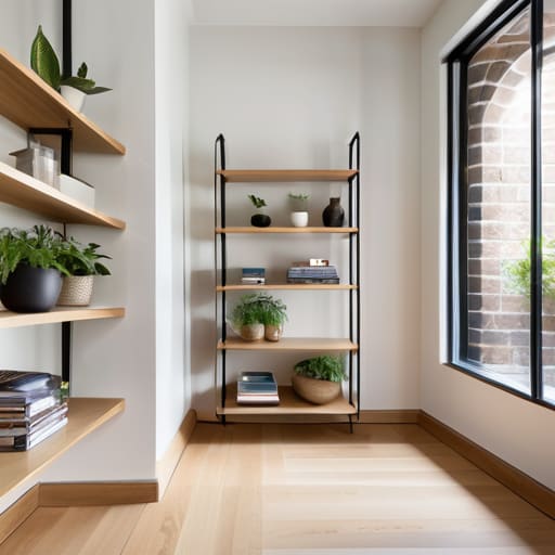
I spent three weeks obsessing over a custom sideboard for a client’s studio apartment, convinced that a low, heavy profile would anchor the room. I even had a prototype in the workshop—a beautiful, brutalist piece of walnut—that I almost shipped. But looking at the sketches, I realized that the piece would have acted like a visual anchor in a sinking ship. Instead, I pivoted toward vertical storage solutions, opting for a wall-mounted shelving system that lifted the weight off the floor.
It’s a lesson I’ve learned repeatedly in my studio: design isn’t about what you add, but about where you manage the tension between mass and void. When you are working with limited square footage, the temptation is to fill every corner to feel “settled.” However, the real magic happens when you prioritize maximizing floor space by keeping the sightlines clear. By choosing pieces with slender legs or suspended elements, you create a sense of continuity that a heavy, floor-bound cabinet simply kills. The decision to leave that floor space empty was the hardest part of the design, but it’s exactly what made the room feel intentional rather than cramped.
The Near Miss Maximizing Floor Space Through Radical Reduction
I have a drawer in my studio dedicated entirely to failed joinery and truncated legs—the physical evidence of my own hesitation. Last month, I found myself staring at a floor plan for a client’s studio that felt suffocatingly dense. My instinct was to fill the void with a series of bespoke, low-slung credenzas to provide a sense of grounding. But as I sat with the sketches, I realized that adding more mass was just a way of hiding my fear of the empty space.
I ended up stripping the plan back to almost nothing, opting for vertical storage solutions that hugged the perimeter rather than colonizing the center. It was a terrifying pivot; a room with too much visible floor can feel unfinished or cold if you don’t get the proportions right. However, by prioritizing maximizing floor space over the comfort of traditional silhouettes, the room finally began to breathe. The design didn’t succeed because of what I added, but because I had the discipline to stop myself from over-furnishing a space that was already trying to tell me it needed room to move.
Choosing the Wrong Path Why Minimalist Decor for Tiny Apartments Works
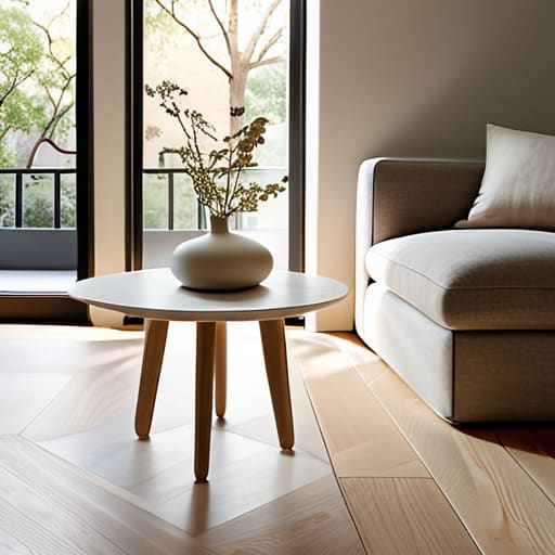
I spent three weeks obsessing over a series of heavy, dark walnut shelving units for a client’s studio apartment. I thought the weight would give the room a sense of permanence, a groundedness that felt necessary. But looking at the sketches, I realized I was making a fundamental error: I was designing for my own ego rather than the room’s breath. I nearly committed to a visual density that would have choked the space, but I pivoted toward minimalist decor for tiny apartments instead. It wasn’t about stripping the soul out of the room, but about choosing pieces that didn’t fight for dominance.
The mistake in small-scale design is often thinking that “more” equals “character.” In reality, a cluttered aesthetic just creates visual noise that makes walls feel like they are closing in. By leaning into intentional emptiness, you allow the few objects that actually matter to stand out. I started looking at how certain color palettes for small rooms could act as a quiet backdrop, rather than a competing texture. It’s the difference between a room that feels like a storage unit and one that feels like a curated sanctuary.
The Risk of Function Multifunctional Furniture Ideas That Almost Failed
I have a shelf in the corner of my studio dedicated to what I call “The Compromises.” It’s filled with joints that didn’t hold and silhouettes that felt too aggressive. Lately, I’ve been looking at a prototype for a nesting coffee table that nearly ended up in that pile. I was obsessed with the idea of multifunctional furniture ideas that could vanish when not in use, but the mechanism I designed was so cumbersome it actually defeated the purpose of saving space. It was a classic case of solving one problem by creating a much more annoying one.
The temptation in small-scale design is to make everything do three things at once, but there is a fine line between cleverness and clutter. I spent weeks trying to integrate a desk into a sideboard, thinking it was the ultimate way of maximizing floor space. Ultimately, I had to scrap it. The piece felt frantic, like it was trying too hard to justify its own existence. I realized that sometimes, the most sophisticated design isn’t about adding a hidden feature; it’s about knowing when a single, well-placed object is enough.
Chasing Light Color Palettes for Small Rooms and Their Consequences
I remember a commission for a studio apartment in Brooklyn where the client insisted on a deep, moody navy for the walls. On paper, it felt sophisticated, but in practice, it swallowed the room whole. I spent three days staring at swatches, eventually pivoting to a desaturated, warm greige. It wasn’t about being “safe”; it was about understanding how color palettes for small rooms interact with the limited photons available. A dark wall doesn’t just absorb light; it creates a visual boundary that makes the perimeter feel like it’s closing in.
The real trick, however, isn’t just picking a light shade, but managing the perceived depth of the space. I once experimented with a high-gloss white on a feature wall to create optical illusions in interior design, hoping to push the wall back. It worked, but it felt clinical—almost like a laboratory. I had to dial it back, opting for a matte finish that caught the light softly rather than bouncing it harshly. Design is often a series of corrections, a constant negotiation between what looks good in a catalog and what actually feels livable when the sun goes down.
Defying Gravity the High Stakes of Vertical Storage Solutions
I have a shelf in my studio, tucked behind the letterpress, that holds a series of modular wall units I designed in the late nineties. They were meant to be the ultimate answer to cramped urban living, but they were a disaster. I had pushed the concept of vertical storage solutions so far that the units felt less like furniture and more like an architectural imposition. They were heavy, visually loud, and they practically shouted at you from the walls. I nearly moved forward with a production run of them, thinking that if I couldn’t expand outward, I would simply conquer the ceiling.
The mistake was forgetting that eyes need a place to rest. When you commit to utilizing every inch of height, you risk creating a sense of claustrophobia that no amount of clever optical illusions in interior design can fix. I learned the hard way that true verticality isn’t about stacking boxes to the rafters; it’s about the tension between what is held and what is left empty. If you don’t leave room for the shadows to move, the room doesn’t feel larger—it just feels like it’s closing in.
The Beautiful Deception Optical Illusions in Interior Design
I remember a prototype for a low-slung lounge chair that sat in my studio for six months, labeled simply: Too heavy for the eye. I had designed it with a thick, solid walnut base, thinking it would ground the room. But in a tight space, that weight felt like an anchor, dragging the visual energy toward the floor. I eventually swapped it for a slender steel frame, a decision that taught me how much we rely on what we don’t see.
This is the core of using optical illusions in interior design. It isn’t about trickery; it’s about managing the perceived volume of a room. I often find myself fighting the urge to fill a corner with a substantial piece of furniture, opting instead for glass, acrylic, or furniture with “leggy” silhouettes. By exposing more of the floor underneath a piece, you aren’t just maximizing floor space—you are tricking the brain into believing the room has more breathing room than it actually does. It is a subtle, necessary lie that makes a cramped apartment feel like a sanctuary.
The Ghost of the Alternative
Designing for a small room isn’t a math problem about square footage; it’s a psychological battle against the urge to fill every void. I often find myself looking at a piece of furniture and wondering if its true value lies in its presence, or in the much more difficult decision to leave that space entirely empty.
Jonathan Marin
The Weight of the Decisions Left Behind
Looking back at this progression—from the radical reduction of floor space to the calculated risks of vertical storage—it becomes clear that designing for a small room isn’t about adding more; it is about the discipline of subtraction. We’ve navigated the tension between the deceptive ease of optical illusions and the heavy, practical reality of multifunctional pieces. Every choice we discussed, whether it was leaning into a specific light-reflecting palette or deciding to let a corner breathe, was a battle against the urge to overfill. Ultimately, a successful small space isn’t a collection of clever tricks, but a carefully curated sequence of trade-offs where every object earns its right to exist.
As I sit here among my own pile of rejected prototypes, I am reminded that the most successful rooms are often the ones that feel slightly unfinished, or perhaps, slightly restrained. Don’t aim for a space that is “perfectly optimized,” because perfection is often just another word for sterile. Instead, aim for a space that reflects the intentionality of your choices. The goal isn’t to hide the constraints of a small footprint, but to honor them. When you look around your room, I hope you don’t just see the furniture; I hope you see the decisions that nearly went the other way, and find beauty in the paths you chose not to take.
