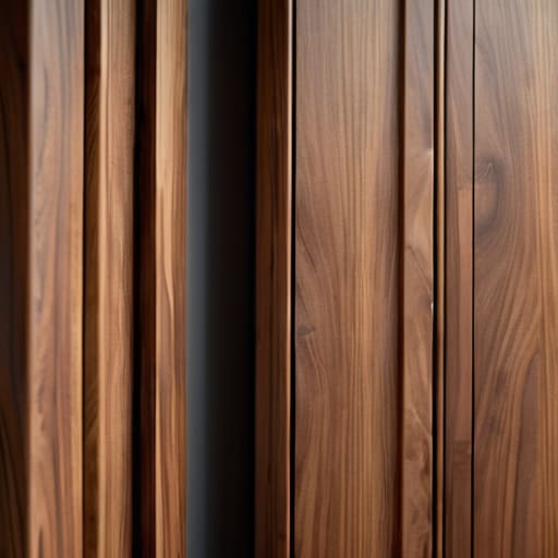
Laying Out Grain Across a Door
I was staring at a slab of walnut last Tuesday, surrounded by the usual graveyard of rejected prototypes, when I realized I’d almost ruined the whole thing. I had been so focused on the structural integrity of the joinery that I completely ignored the visual pull of the timber. People love to talk about “flow” and “organic movement” as if they’re mystical forces, but the truth is much more clinical and much more frustrating. They treat it like a decorative afterthought, but if you don’t understand how grain direction shapes a design, you aren’t actually designing; you’re just getting lucky with the material.
I’m not here to give you a lecture on wood anatomy or sell you on some expensive, high-concept theory. I want to talk about the actual, messy reality of working with living material. I’m going to show you how to make those high-stakes calls—the ones that determine whether a piece feels intentional or just accidental—by looking at the grain as a set of constraints rather than a suggestion. We’ll skip the fluff and focus on the decisions that actually make a piece hold together, both physically and visually.
The Near Miss How Grain Direction Shapes a Design
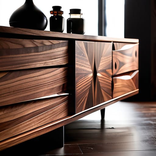
I have a shelf in the back of my studio, mostly hidden by half-empty ink jars from my letterpress setup, that holds the ghosts of my career. There’s a walnut sideboard prototype from five years ago that sits there, a reminder of a moment I almost ruined a perfectly good piece of timber. I had originally intended to run the grain horizontally to emphasize the length of the chamfered edges, but something about the way the light hit the sample made me hesitate. I pivoted, opting for a vertical orientation instead, and that single shift changed the entire visual weight and grain direction of the piece.
If I had stuck to my original plan, the sideboard would have felt heavy, almost anchored to the floor in a way that felt sluggish. By turning the grain, I let the wood breathe upward. It wasn’t just about the wood grain visual flow; it was about how the light catches the ridges of the fibers. When you’re working with something this alive, you realize that you aren’t just building a shape—you are negotiating with a pattern that was decided long before you ever picked up a chisel.
Chasing the Line Mastering Wood Grain Visual Flow
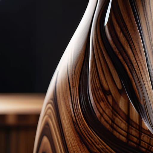
When I’m staring at a slab of walnut, I’m not just looking at a piece of wood; I’m looking at a map of tension. There is this constant, quiet tug-of-war between the wood grain visual flow and the actual silhouette of the piece. If you let the pattern wander aimlessly, the chair looks like it’s melting. But if you force it too strictly, it feels clinical, like something spat out by a CNC router rather than something born from the tree. I’ve spent many late nights in the studio trying to find that sweet spot where the grain seems to follow the curve of the leg, almost as if the wood wanted to be shaped that way all along.
It’s a delicate balancing act of visual weight and grain direction. You might have a heavy, tapered base that demands a vertical orientation to ground it, but then you have a sweeping tabletop that begs for a horizontal sweep to elongate the room. If you miss that connection, the whole piece feels disjointed. It’s about making sure the eye moves through the object without hitting a sudden, jarring wall of texture.
The Weight of the Fiber Visual Weight and Grain Direction
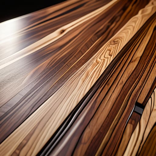
There’s a specific kind of heaviness that comes with a piece of timber, even before you’ve made a single cut. I’ve spent many afternoons staring at a slab, trying to figure out if the pattern is going to anchor the room or just make the furniture feel like it’s sliding off the floor. It’s about visual weight and grain direction; if you run the grain against the natural lines of sight, the piece feels stubborn, almost defiant. I remember a dining table prototype sitting in my “reject” pile because the grain felt too “busy” at the base. It wasn’t a structural failure, but it was a psychological one. The wood was pulling the eye downward too aggressively, making the whole design feel unsettled.
When you’re working with thinner stock, the stakes change. You start thinking about wood veneer orientation not just as a way to save money, but as a way to manipulate how much “presence” an object has. If I orient the grain to follow the sweep of a chair’s back, the piece feels light, almost kinetic. If I fight it, the piece becomes a monolith. It’s a delicate balance between respecting the material and forcing it to do your bidding.
A Dangerous Tilt the Structural Integrity of Wood Grain
There is a specific kind of anxiety that sets in when you’re looking at a slab of walnut that is as beautiful as it is temperamental. In my studio, I have a shelf of “ghost” joints—pieces where I pushed a design too far, ignoring the way the fibers actually want to behave. You can obsess over the material texture aesthetics all day, but if you ignore the structural integrity of wood grain, the piece won’t just look bad; it will physically fail you. I remember a chair leg I designed years ago where I prioritized a sweeping, continuous line that ignored the natural tendency of the grain to split under load. It looked like a masterpiece on paper, but it was essentially a ticking time bomb.
It’s a constant tug-of-war between what the eye wants and what the physics demand. When you’re designing with natural patterns, you aren’t just an artist; you’re a negotiator. You have to decide if you’re going to fight the wood to achieve a specific silhouette or if you’re going to yield to the tension inherent in the grain to ensure the piece actually lasts more than a single season.
The Error We Avoided Designing With Natural Patterns
I remember a walnut sideboard I was working on back in 2012. I had these beautiful, swirling slabs that practically begged to be laid out in a book-matched pattern. It looked incredible on the shop floor, but the moment I sat in the chair to look at it from a human perspective, it felt chaotic. I was so enamored with the spectacle of the pattern that I’d ignored how the eye actually moves across a surface. I almost went with that loud, symmetrical display, but I caught myself. I realized that by chasing the spectacle, I was sacrificing the material texture aesthetics that make a piece feel grounded rather than performative.
Instead, I pivoted. I decided to lay the pieces in a more subtle, staggered sequence. It wasn’t as “wow” at first glance, but it allowed for a much more coherent wood grain visual flow that guided the viewer toward the joinery rather than distracting them from it. It’s a lesson I carry into every project now: designing with natural patterns isn’t about showing off what the tree did; it’s about curating the rhythm of what the user sees.
Surface Tension Material Texture Aesthetics and Intent
I remember a walnut sideboard I worked on three years ago—it’s sitting in my “reject” pile now, labeled “Too busy, lost the quiet.” I had spent weeks obsessing over the wood veneer orientation, trying to force a certain rhythm that just wasn’t there. I thought I could control the way the light hit the surface, but the wood had its own agenda. When you’re dealing with material texture aesthetics, you quickly learn that you aren’t actually the boss; you’re more like a negotiator.
If you push the grain too hard to create a specific pattern, the piece starts to feel performative, like it’s trying too hard to be “designed.” There is a specific kind of tension that happens when the tactile reality of the wood meets the intended geometry of the furniture. You want that seamless transition, but if you ignore how the light catches the microscopic ridges of the fiber, the whole thing feels flat. The goal isn’t to mask the material, but to find that sweet spot where the visual weight and grain direction actually cooperate with the way a person’s hand will eventually rest on the surface.
The Final Pivot Choosing Wood Veneer Orientation
I remember sitting on the floor of my studio three years ago, surrounded by a dozen thin slices of walnut veneer that, on paper, were identical. I had the CAD drawings perfected, the dimensions locked, and the production schedule ready to go. But as I laid them out under the shop lights, I realized I was staring at a crisis of identity. If I went with a traditional book-match, the piece would feel symmetrical, almost too safe—like a math equation solved correctly but without any soul.
I ended up pivoting to a slip-match orientation instead. It was a gamble because it disrupted the expected wood grain visual flow, making the surface feel more organic and perhaps a bit more restless. I spent an hour just sliding those sheets around, trying to decide if the pattern should feel like a steady stream or a sudden gust of wind. In the end, that choice to embrace the slight irregularity was what gave the sideboard its character. It’s funny; most people see the finished surface and think it was inevitable, but for me, it was the moment I almost played it safe that still defines the piece.
## The Ghost of the Alternative
Most people look at a finished chair and see a static object, but when I look at it, I see the tension of the grain pulling one way while my hand almost pulled it another. A design isn’t just the wood you use; it’s the ghost of the direction you rejected to make the piece feel like it’s actually breathing.
Jonathan Marin
The Ghost in the Grain
Looking back at the sketches and the pile of rejected offcuts in the corner of my studio, it’s clear that grain direction isn’t just a technical checkbox. It is the invisible hand that dictates whether a chair feels grounded or like it might float away, and whether a tabletop invites a touch or repels it. We’ve navigated the tension between structural necessity and that elusive visual flow, moving from the heavy weight of the fibers to the delicate, high-stakes decision of veneer orientation. In the end, every piece of furniture is a negotiation with a living material—a constant tug-of-war between the designer’s intent and the stubborn, beautiful reality of how the tree actually grew.
I often think about my manifesto when I’m staring at a finished piece that finally feels right. Most people see the polished surface and the clean lines, but I see the moment I almost turned the grain ninety degrees and ruined the whole rhythm. Design isn’t about finding the perfect, inevitable path; it’s about navigating the wrong ones until you find the truth. Don’t aim for perfection that feels sterile. Instead, aim for that deliberate tension where the material and the maker finally stop fighting and start speaking the same language. That is where the real craft lives.
