
A Sketch That Missed the Mark
I was sitting on my studio floor three years ago, surrounded by the smell of sawdust and the low hum of a CNC router, staring at a technical render that was, quite frankly, a masterpiece of uselessness. I had spent four days perfecting the joinery for a lounge chair, obsessing over a seamless transition that looked incredible on paper but ignored the fact that the user’s actual problem was lumbar support, not aesthetics. It was a drawing that solved the wrong problem, a polished solution to a question no one was actually asking. We’ve all been there—falling in love with the elegance of our own logic while the actual utility of the object slips through our fingers.
I’m not here to give you a lecture on design theory or tell you to “think outside the box.” Instead, I want to talk about the messy, frustrating reality of catching yourself mid-pivot. I’ll be sharing what I’ve learned from two decades of moving between bespoke studio work and mass production about how to recognize when your technical skill is actually masking a fundamental misunderstanding. We are going to look at how to embrace the pivot, because the most important part of the process is often the moment you realize you were heading in the wrong direction.
The Elegance of the Error a Drawing That Solved the Wrong Problem
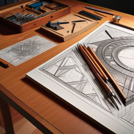
I remember a specific sketch for a modular shelving unit—a series of intricate, interlocking wooden joints that looked nothing short of sculptural. I had spent three days perfecting the line weights and the way the shadows fell across the grain. On paper, it was a masterpiece of geometry. But as I stared at it under the studio lights, I realized I wasn’t actually designing a shelf; I was designing a puzzle. I had fallen into one of those classic design thinking pitfalls where the elegance of the solution obscures the utility of the object.
The drawing was a perfect response to a ghost. I had spent so much energy refining the aesthetic complexity that I completely missed the symptom vs problem distinction. The user didn’t need a complex mechanical interlocking system; they needed a way to store heavy books without the unit wobbling. I had solved for visual tension when I should have been solving for structural stability. It is a humbling realization, sitting there with a beautiful piece of paper that serves no one, but looking back at that failed sketch in my archive, I can see exactly where my focus drifted from the actual constraint to a mere stylistic whim.
Chasing Symptoms While Ignoring the Root Cause Analysis in Design

In my studio, I have a shelf of what I call “the pacifiers.” They are prototypes that look incredibly polished, yet they do absolutely nothing to solve the actual tension in a chair’s joinery or the way a person’s weight shifts during a long afternoon of reading. These are the results of chasing symptoms rather than the source. It is a common trap in the middle stages of a project: you find a friction point, and instead of digging into the structural reason it exists, you simply draw a more aesthetic way to mask it. We mistake a clever visual patch for a functional breakthrough, falling straight into one of the most exhausting design thinking pitfalls.
The danger lies in the seductive nature of the immediate fix. When you are deep in the weeds of a deadline, there is a massive temptation to prioritize the visible symptom over the underlying mechanics. You might refine the silhouette or tweak the material finish to hide a fundamental instability, but that isn’t design; it’s just high-end camouflage. True root cause analysis in design requires the discipline to stop drawing the solution for a moment and instead sit with the discomfort of the actual problem. If you don’t master the symptom vs problem distinction early on, you aren’t building a product—you’re just decorating a failure.
The Cost of Misaligned User Needs in a Perfect Sketch

There is a specific kind of heartbreak that comes with looking at a technically flawless drawing and realizing it is utterly useless. I remember a series of sketches for a modular shelving unit—the lines were clean, the joinery was sophisticated, and the aesthetic was exactly what the client asked for. But as I sat there with the ink still drying, I felt that familiar pit in my stomach. I had fallen into one of those classic design thinking pitfalls where I was so enamored with the geometry of the solution that I had completely ignored the actual physical constraints of the user’s space.
The sketch was a masterpiece of technical execution, yet it failed because it was built on misaligned user needs. I had solved for how the object looked on a pedestal, rather than how it would function in a cramped, lived-in apartment. It was a beautiful, expensive distraction. When you focus entirely on the elegance of the stroke, you risk losing the symptom vs problem distinction; you end up polishing a symptom of a misunderstanding rather than addressing the core reality of the person who will actually live with your work.
Navigating Design Thinking Pitfalls Through the Lens of Failure
I’ve spent a lot of my career staring at those discarded sketches in my studio—the ones I once thought were triumphs. When you’re deep in the weeds of a project, it is incredibly easy to fall into common design thinking pitfalls, primarily because our brains are wired to seek the dopamine hit of a solution. We see a friction point, we sketch a fix, and we feel a sense of accomplishment. But more often than not, we haven’t actually solved anything; we’ve just decorated a symptom.
The real work, the heavy lifting that actually separates a craftsman from a decorator, lies in the symptom vs problem distinction. It requires a certain level of intellectual humility to stop drawing and start questioning. You have to be willing to dismantle your own momentum to ensure you aren’t just performing effective problem framing through a lens of convenience. I’ve learned that the most dangerous moment in any design cycle isn’t when the sketch looks terrible, but when it looks perfect for a problem that doesn’t actually exist.
The Crucial Symptom vs Problem Distinction in Visual Problem Solving
In my studio, there is a shelf of skeletal chair frames—mostly plywood and failed joinery—that serves as a graveyard for my early career. Looking at them now, I realize most weren’t failures of craftsmanship, but failures of perception. I was often so enamored with the visual tension of a curve or the way a line met a plane that I mistook a superficial aesthetic itch for a functional requirement. This is the trap of the symptom vs problem distinction; I was treating the “symptom” of a clunky silhouette by adding more material, rather than addressing the underlying structural logic.
When you fall into these design thinking pitfalls, your sketches become incredibly polished versions of something useless. You end up with a drawing that looks authoritative and “solved,” yet it fails to move the needle because it’s addressing a ghost. I’ve learned that effective problem framing is much harder than the actual drawing. It requires the discipline to stop sketching for a moment and ask if the line you’re drawing is actually fixing the user’s struggle, or if you’re just decorating a mistake.
Embracing Iterative Design Failures to Find the Hidden Truth
I have a shelf in the back of my studio, tucked behind the samples of walnut and birch, that serves as a graveyard for my better intentions. It is filled with models and sketches that looked impeccable on paper but failed the moment they met reality. I used to view these as wasted hours, but I’ve come to realize that iterative design failures are actually the most honest moments in the process. When a prototype fails, it isn’t just a technical error; it is the material or the user pushing back against a false assumption.
To truly progress, you have to stop treating every setback as a setback and start seeing it as a data point. Most of the time, we aren’t failing at the execution; we are failing at the effective problem framing. We spend weeks refining the curve of a chair leg only to realize the actual issue was the way the joint handles weight distribution. If you can master the symptom vs problem distinction during these messy middle stages, you stop chasing ghosts and start designing for what actually exists.
Mastering Effective Problem Framing Through the Art of Redirection
I have a shelf in my studio dedicated to the “near misses”—those sketches and models that looked impeccable on paper but failed the moment they met the user. To move past these, one has to learn that redirection isn’t about fixing a bad drawing; it’s about questioning why the drawing was necessary in the first place. Mastering effective problem framing requires a certain level of intellectual discomfort. You have to be willing to set aside a beautiful, polished solution if you realize you’ve merely been decorating a symptom rather than addressing the actual friction point.
It is a disciplined sort of pivot. Instead of refining the lines of a chair leg that is clearly too thin, you step back and ask if the seating height is the actual issue. This is where the symptom vs problem distinction becomes a practical tool rather than a theoretical concept. By intentionally redirecting your focus away from the immediate visual fix, you stop the cycle of polishing errors and start the harder, more rewarding work of finding the right question to answer.
The Ghost in the Sketch
There is a particular kind of heartbreak in a technically perfect drawing—one where every line is clean and every proportion is balanced—only to realize you’ve spent a week beautifully decorating a solution to a problem that doesn’t actually exist.
Jonathan Marin
The Value of the Wrong Turn
Looking back at that stack of rejected prototypes in the corner of my studio, I realize that none of them were truly wasted time. We spent this entire discussion dissecting how easy it is to fall in love with a beautiful sketch that actually solves nothing, or how we often mistake a polished symptom for the actual disease. Whether it is misidentifying a user need or chasing a visual elegance that ignores the structural reality, the trap is always the same: we solve for the aesthetic of the solution rather than the integrity of the problem. If we don’t learn to distinguish between a symptom and a root cause, we aren’t designing; we are just decorating our own misunderstandings.
Ultimately, I have come to believe that the most vital tool in a designer’s kit isn’t a high-end stylus or a precision caliper, but the ability to look at a “perfect” drawing and ask, “What am I actually fixing here?” Don’t fear the drawing that goes down the wrong path. Those errors are the friction required to find the truth. The most meaningful work rarely emerges from a straight line; it comes from the messy, often frustrating process of discarding the elegant lie to finally arrive at the difficult truth.
