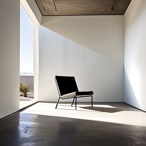
The Spaces Between the Parts
I spent most of last Tuesday digging through a cardboard box in the corner of my studio, pulling out a prototype for a walnut chair that failed because the proportions felt suffocating. It’s a physical reminder of the mistake most designers make: they treat emptiness like a void that needs to be conquered. We’re taught that more is more, or that every millimeter of a surface must justify its existence with a detail, a texture, or a curve. But if you’re looking for a textbook lecture on how to design with negative space, you’ve come to the wrong place. Real design isn’t about filling a vacuum; it’s about the calculated courage to leave things alone.
I’m not here to give you a set of sterile rules or a checklist of “do’s and don’ts” that you can find in any introductory manual. Instead, I want to talk about the tension that exists in the gaps. I’ll be sharing what I’ve learned from twenty years of making things—and breaking them—to show you how to use the empty parts of a composition to actually give your work room to breathe. We’re going to look at the decisions that almost went the other way, because that’s where the real craft lives.
The Art of the Near Miss How to Design With Negative Space
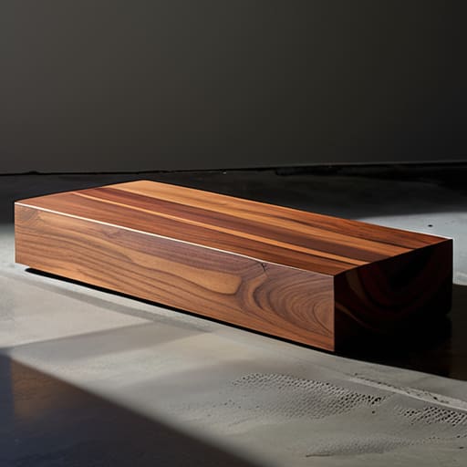
I have a shelf in the back of my studio, tucked behind the samples of walnut and oak, where the “failures” live. They aren’t failures in the sense of being broken, but rather pieces where I overcompensated—where I felt the urge to fill a void rather than respect it. I look at those rejected prototypes and realize that most design errors stem from a fear of the void. We treat empty space as a vacuum that needs to be filled, rather than a structural component. In reality, achieving a true sense of balance and breathing room requires the courage to leave a surface untouched.
When I’m working on a new layout or a piece of furniture, I’ve learned that the most successful compositions aren’t defined by what I add, but by what I have the discipline to omit. It’s about managing the tension between the object and its surroundings. By applying certain minimalist design principles, you realize that the void isn’t just nothingness; it is the framework that gives the subject its weight. If you crowd the frame, you don’t add importance; you only add noise, drowning out the very thing you intended to highlight.
Resisting the Urge to Fill Every Corner
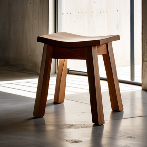
There is a specific kind of anxiety that sets in halfway through a project—a restless, itching compulsion to justify the existence of every square inch. In my studio, I see it constantly. It’s the impulse to add a decorative bevel to a table leg or a secondary texture to a fabric simply because the void feels too vulnerable. We mistake emptiness for a lack of effort, when in reality, the most disciplined part of the process is knowing when to stop.
True balance and breathing room aren’t achieved by adding more elements to anchor a composition, but by having the courage to let a single object stand alone. When we succumb to the urge to fill every corner, we actually collapse the visual hierarchy and white space that allows a viewer to actually process what they are looking at. A design that is too loud becomes a wall of noise; a design that respects the void becomes a conversation. I’ve spent years looking at my graveyard of rejected prototypes, and more often than not, the failures weren’t due to a lack of detail, but an inability to let the piece simply exist.
Finding Balance and Breathing Room in Chaos
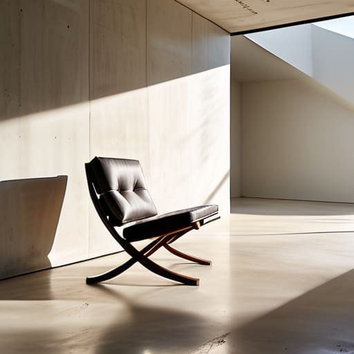
In my studio, I often find myself staring at a floor plan or a technical drawing where everything feels too loud. It’s that frantic, cluttered energy that happens when we try to solve a problem by adding more rather than subtracting. To find true balance and breathing room, you have to stop treating emptiness as a void that needs fixing. I’ve learned that a well-placed gap isn’t just “nothing”—it is a structural necessity. It’s the silence between notes that makes the melody coherent.
When I’m working on a piece, I look for the tension between the heavy and the light. This isn’t just about aesthetics; it’s about visual hierarchy and white space working in tandem to guide the eye. If every corner of a composition is fighting for attention, the viewer ends up exhausted, looking at nothing in particular. By deliberately leaving certain areas untouched, you aren’t just practicing minimalist design principles; you are giving the important elements permission to actually exist. You are creating a path through the chaos, ensuring the most vital part of the design is the only thing that truly breathes.
The Tension Found in Minimalist Design Principles
There is a seductive trap in minimalism that many mistake for simplicity. They think it means subtraction, a clinical stripping away of everything until nothing remains but a sterile void. But true minimalism isn’t about being empty; it is about the controlled weight of what stays. When I’m working on a chair leg or a tabletop, I’m not just looking for what to remove, but how the absence of a feature dictates the gravity of the piece. This is where visual hierarchy and white space become more than just textbook terms; they become the structural bones of the work.
In a well-composed layout or a piece of furniture, the tension arises from the relationship between the object and the void. If you lean too hard into minimalism, the piece loses its soul and becomes merely an absence. If you lean too far into ornamentation, the message is lost in the noise. The goal is to find that narrow, uncomfortable ledge where the eye is forced to travel through the emptiness to find the meaning. It is the deliberate orchestration of nothingness that gives the “something” its actual power.
Mastering Visual Hierarchy and White Space
I’ve spent many late nights staring at a drafting table, convinced that a piece of furniture lacked “presence” simply because it felt hollow. I used to think presence was something you added—a heavier grain, a bolder silhouette. But through years of trial and error, I’ve learned that what actually dictates the eye’s movement is the relationship between what is there and what isn’t. When we talk about visual hierarchy and white space, we aren’t just talking about leaving gaps; we are talking about directing the gaze. If every element is screaming for attention, the result is just noise. You need that emptiness to act as a conductor, guiding the viewer toward the one thing that actually matters.
In my studio, I often look at my pile of rejected prototypes to understand this. Many failed because they lacked a clear path for the eye to follow. By applying certain graphic design composition techniques to physical form, you realize that whitespace is the silent partner of importance. It provides the necessary structural silence that allows a single detail—a joinery notch or a tapered leg—to resonate. Without that intentional void, your design doesn’t have a hierarchy; it just has a crowd.
The Quiet Power of Effective Use of Empty Space
I have a shelf in the corner of my studio dedicated to what I call “the ghosts.” They are the chair legs that were too spindly, the joinery that felt too aggressive, the prototypes that failed because they tried too hard to be heard. In furniture, as in layout, we often mistake activity for progress. We think that by adding a bevel or a decorative inlay, we are adding value. But there is a specific, quiet weight to an effective use of empty space that no amount of ornamentation can replicate. It is the difference between a room that feels crowded and a room that feels intentional.
When I’m working on a composition, I try to view the void not as a lack of content, but as a structural component. It functions much like the air between the slats of a chair; it provides the balance and breathing room necessary for the eye to actually rest. If you crowd the frame, you aren’t guiding the viewer; you are merely exhausting them. The most profound moments in a design often happen in the gaps, where the silence allows the primary subject to finally speak for itself.
Refining Composition Through Strategic Graphic Design Techniques
When I’m working at the letterpress, or even when I’m sketching a new chair leg, I find myself constantly fighting the impulse to add “just one more thing” to justify the cost of the material. In the digital realm, this translates to a struggle with graphic design composition techniques that often lean too heavily on decoration. To truly refine a piece, you have to stop looking at what you’re adding and start looking at what you’re allowing to exist. It isn’t about emptiness; it’s about the deliberate management of what the eye is permitted to touch.
I often think back to a prototype for a side table that I scrapped because the joinery felt too loud. I realized that by adding more structural bracing, I had actually suffocated the silhouette. The same logic applies to layout work. By prioritizing improving readability with whitespace, you aren’t just making a page easier to scan; you are creating a roadmap for the viewer’s attention. You are essentially designing the silence between the notes, ensuring that when the important elements finally arrive, they actually have the room to matter.
The Ghost in the Blueprint
We spend so much time obsessing over the joinery and the grain of the wood, but the real soul of a piece lives in the void we left behind—the space where we almost added a drawer, or a shelf, or a flourish, and chose instead to let the air breathe.
Jonathan Marin
The Weight of What Isn't There
Looking back at the sections we’ve covered, it becomes clear that negative space isn’t just a void to be managed; it is a structural component, as vital as the wood grain in a tabletop or the ink on a letterpress block. We have explored how to resist the impulse to overfill, how to use white space to establish a hierarchy, and how to find a sense of calm within the inherent chaos of a composition. Ultimately, mastering this discipline means understanding that control is often found in what you choose to omit. When we stop treating emptiness as a problem to be solved and start treating it as a tool for tension, the work begins to breathe.
I often look at the graveyard of prototypes in the corner of my studio—the chairs with legs too thick, the tables with surfaces too busy—and I realize they all failed because they were afraid of the silence. They tried to shout to prove they existed. But true design maturity comes when you have the courage to let an object, or a layout, exist in the quiet. Don’t be afraid to leave the room empty. In the end, the most resonant part of any creation is often the decision that nearly went the other way, the one where you chose the stillness over the noise.
