The Discipline of Leaving It Alone
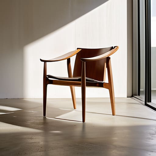
I was staring at a prototype for a walnut lounge chair last Tuesday, surrounded by the usual graveyard of “better ideas” that never made the cut. There was this one specific brass inlay I had planned—a tiny, elegant detail that felt like the finishing touch—but as I sat there in the quiet of the studio, I realized it was actually a distraction. We are constantly sold this myth that design is an additive process, a quest to layer on more “soul” or “character” until the object feels complete. But that’s nonsense. The truth about what restraint achieves in design isn’t about what you lose; it’s about the clarity you gain when you finally stop trying to prove how clever you are.
I’m not interested in giving you a lecture on minimalism or the aesthetic of “less is more,” which usually just ends up sounding like a luxury marketing slogan. Instead, I want to talk about the friction of making those hard calls. I’m going to share what I’ve learned from twenty years of watching beautiful ideas die so that better ones could live, focusing on the practical, often painful discipline of knowing when to walk away from a feature.
The Ghost of the Rejected Idea What We Chose Not to Include
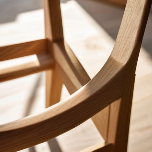
I have a shelf in the corner of my studio that most people would call a graveyard. It’s filled with bent plywood that didn’t hold the curve, brass fittings that felt too heavy, and joinery that was technically perfect but emotionally hollow. I label each one—too busy, lost the line, distracting. These aren’t failures; they are the ghosts of the decisions that almost defined the piece. When I’m working on a new chair, the hardest part isn’t deciding what to add, but identifying the exact moment where a detail stops serving the form and starts competing with it.
This process is less about following rigid minimalist design principles and more about a constant, exhausting negotiation with one’s own impulses. You find yourself hovering over a sketch, wanting to add a decorative chamfer or a contrasting wood grain, only to realize that doing so would shatter the visual hierarchy and clarity you’ve spent weeks establishing. True restraint is the ability to sit with that itch to embellish and instead choose the silence of a clean edge. It is the quiet discipline of knowing that every extra line is a debt the eye eventually has to pay.
Finding Meaning in the Void the Power of Negative Space
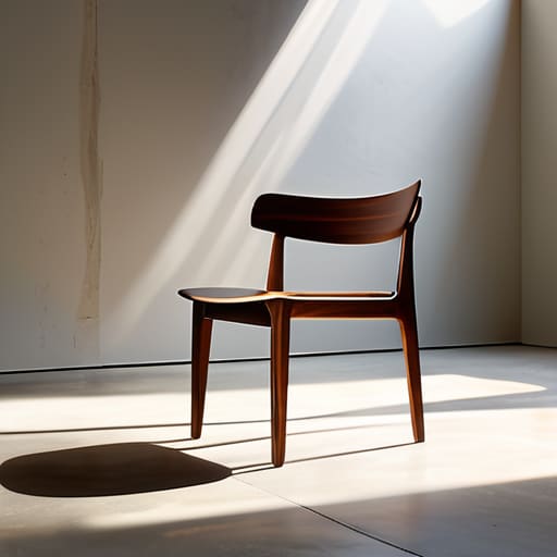
I spent most of last Tuesday staring at a chair leg that simply refused to sit still. It was technically perfect, structurally sound, and utterly exhausting to look at. In my studio, I have a shelf dedicated to these kinds of failures—pieces that were too “loud” for their own good. I realized then that I wasn’t fighting the wood; I was fighting my own impulse to fill every available inch with detail. We often mistake density for value, but true intentionality in aesthetics requires the courage to leave a gap.
When I work with negative space, I’m not just looking at empty air; I’m looking at the breathing room that allows the eye to actually rest. If every surface is textured or every joint is exposed, you lose all sense of visual hierarchy and clarity. The object becomes a scream rather than a conversation. By leaning into the void, I’m not subtracting importance; I’m providing the silence necessary for the remaining details to actually be heard. It is a disciplined sort of subtraction that turns a cluttered object into a singular statement.
The Precision of the Cut Effective Design Editing Techniques
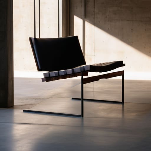
There is a specific kind of violence in the editing process. When I’m working on a new chair or even just setting type on my letterpress, the urge to “fix” a perceived emptiness is almost visceral. You feel like you’re leaving a wound open if you don’t fill it. But true effective design editing techniques aren’t about subtraction for the sake of being sparse; they are about the surgical removal of anything that competes with the primary intent. If a joint is beautiful but distracts from the silhouette, it has to go.
I’ve learned that if you don’t approach a piece with a sense of intentionality in aesthetics, you end up with a cluttered mess of “good ideas” that cancel each other out. It’s easy to mistake complexity for depth. In reality, the most disciplined work happens when you use a sharp mental blade to strip away the noise, ensuring that the user’s eye follows a clear, unobstructed path. You aren’t just making things smaller; you are curating the experience of looking at them.
The Silent Victory of What Restraint Achieves in Design
There is a specific kind of quiet that settles over a room when a piece of furniture actually works. It isn’t the loud, demanding presence of a statement piece that shouts for your attention; it’s the absence of friction. When I’m working through a new chair design, I’m constantly fighting the urge to “solve” a problem with an extra detail—a bevel here, a decorative join there. But true restraint isn’t about subtraction for the sake of emptiness; it is about intentionality in aesthetics. It’s the hard-won victory of knowing that by removing the noise, the structural truth of the object can finally breathe.
When we succeed in this, we aren’t just making things look “clean.” We are actively avoiding cognitive overload for the person interacting with the object. If a table has too many competing textures or unnecessary chamfers, the eye never finds a place to rest. It wanders, frustrated. The victory lies in creating a sense of visual hierarchy and clarity where the user intuitively understands the form without having to decode it. It’s the difference between a design that asks a question and one that provides an answer.
Guiding the Eye Visual Hierarchy and Clarity Through Omission
I spent most of last Tuesday staring at a prototype for a small walnut side table. I had originally planned to add a brass inlay to the rim—a little something to catch the light—but every time I looked at it, the piece felt frantic. It was shouting when it should have been whispering. By stripping that detail away, I wasn’t just making it simpler; I was establishing a clear visual hierarchy and clarity that allowed the grain of the wood to actually speak.
When we clutter a surface with too many competing focal points, we trigger a sort of mental friction. In my studio, I’ve learned that avoiding cognitive overload is less about subtraction and more about direction. If everything is emphasized, nothing is. You have to curate the viewer’s experience by deciding what deserves their attention and, more importantly, what doesn’t. It’s a quiet kind of discipline—the realization that a well-placed void directs the eye far more effectively than a dozen decorative flourishes ever could.
The Weight of Every Mark Intentionality in Aesthetics
In my studio, there is a shelf—a graveyard of sorts—filled with bent plywood and failed joinery. Each piece is tagged with a note explaining why it failed, but more importantly, why it was allowed to fail. When you are working with physical materials, you quickly realize that every single line, every bevel, and every grain direction carries a specific gravity. You cannot hide behind a flourish or a decorative trim. In furniture design, as in letterpress, there is no such thing as an “accidental” mark. If a leg is tapered, it is because that taper serves a purpose, whether structural or visual. This is the core of intentionality in aesthetics: the understanding that once a mark is made, it becomes a permanent commitment.
When I sit down to draft a new piece, I am constantly fighting the urge to “fix” a clean surface with more detail. It is a common trap to think that more complexity equals more value, but that is usually just a way of masking indecision. True craftsmanship is about avoiding cognitive overload for the person interacting with the object. If I add a notch where it isn’t needed, I haven’t added beauty; I’ve only added noise. Every element must earn its right to exist on the surface.
The Mercy of Less Avoiding Cognitive Overload
I spent three weeks last month wrestling with a sideboard prototype, convinced that a series of intricate, routed grooves would give the wood some much-needed character. I had the sketches, the CAD files, and a growing sense of pride. But when I finally sat in the workshop, staring at the raw slab, I realized those lines weren’t adding character—they were adding noise. They were demanding attention that the piece hadn’t earned.
This is the fundamental struggle of avoiding cognitive overload. When we clutter a design with too many competing focal points, we aren’t being expressive; we are being loud and, ultimately, exhausting. A user shouldn’t have to work to understand how to interact with an object. By applying effective design editing techniques, I eventually scraped those grooves away. The resulting surface was quiet, allowing the grain to speak for itself. It was a lesson in mercy: sometimes the kindest thing a designer can do is step back and let the object breathe, ensuring the mind isn’t forced to process a thousand tiny, unnecessary decisions just to appreciate a single chair or table.
The Cost of the Extra Inch
I have a shelf in the back of my studio filled with sawdust and failed intentions—prototypes where I thought one more bevel or one more brass inlay would “complete” the piece. But looking at them now, I realize that every time I tried to add something, I was actually just trying to hide a lack of conviction. Real design isn’t about finding the right thing to add; it’s about having the stomach to stop when the object finally starts to breathe on its own.
Jonathan Marin
The Final Cut
Looking back through the stacks of my rejected prototypes—each one a small, wooden monument to a “what if”—I realize that restraint isn’t about deprivation. It isn’t about the absence of creativity, but rather the discipline of selection. We’ve discussed how omitting the unnecessary clears the visual noise, how negative space provides the breath a piece needs to live, and how every intentional mark carries a weight that unconsidered flourishes simply cannot match. Design, at its most honest, is a process of subtraction where we strip away the ego until only the essential truth of the object remains.
In the end, I’ve learned that the most profound part of my work doesn’t happen when I find the perfect detail, but when I have the courage to walk away from a “good” idea to protect a great one. We often mistake complexity for depth, but true sophistication lies in the quiet confidence of knowing when to stop. So, the next time you find yourself reaching for that extra ornament or that final, unnecessary curve, I hope you remember the power of the void. Let the decisions you didn’t make be the ones that ultimately define your work.
