Proportion Is Decided by Eye, Then Checked
I was staring at a prototype for a walnut sideboard last Tuesday, surrounded by the usual graveyard of failed ideas, when it hit me again. We spend so much time talking about “golden ratios” and mathematical formulas as if design were a solved equation, but that’s a lie. You can follow every rule in a textbook and still end up with something that feels fundamentally wrong. The truth is much messier; it’s about that gut-level tension you feel when a leg is a fraction too thin or a tabletop is just a hair too heavy. It’s not about math—it’s about how proportion decides whether a piece works by navigating the razor-thin line between balance and boredom.
I’m not here to give you a lecture on geometry or sell you on some expensive software. Instead, I want to talk about the near misses—the moments where a design almost collapsed under its own weight before a single adjustment saved it. I’ll be sharing what I’ve learned from twenty years of making things, focusing on the actual, tactile decisions that separate a functional object from a masterpiece. We’re going to look at the constraints that actually matter, moving past the theory and into the real, grit-under-the-fingernails reality of making things hold together.
The Near Miss How Proportion Decides Whether a Piece Works
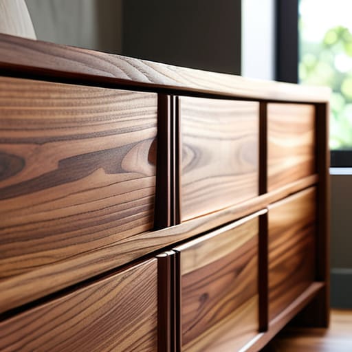
I remember a walnut sideboard I spent three months prototyping back in 2008. I had the joinery perfected, the grain matched, but something felt off. It sat in the studio like a heavy, silent accusation. I kept adjusting the height of the plinth, thinking I could fix it with more mass, but I was only digging a deeper hole. I eventually realized I was fighting against the very compositional scale and weight I had intended to create. I had made the base too substantial, turning a piece meant to float into something that felt anchored to the floor by sheer, clumsy gravity.
The breakthrough didn’t come from adding more; it came from a radical subtraction. I had to shave nearly two inches off the leg taper to restore the aesthetic equilibrium. It was a terrifying moment—that split second where you wonder if you’re actually improving the piece or just destroying it. But when I finally stepped back, the tension vanished. The object finally breathed. That’s the thing about design: it isn’t about following a mathematical formula, but about finding the exact point where the object stops fighting its own shadow.
The Tension of Choice Mastering Compositional Scale and Weight
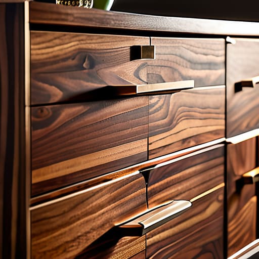
I spent three weeks wrestling with a walnut sideboard last autumn, trying to find the right rhythm for the drawer pulls. It wasn’t about where they sat on the map, but how they anchored the piece. When you’re working with something this heavy, you start to realize that compositional scale and weight aren’t just academic concepts; they are physical pressures. If the hardware is too delicate, the sideboard feels like it’s floating, untethered from the floor. If it’s too massive, the whole thing looks like it’s being crushed under its own gravity.
I ended up choosing a brass casting that felt almost too aggressive in the initial sketches. I almost tossed it into the “Rejected” bin—right next to the prototype from 2014 that failed for being too timid. But in the end, that slight heaviness provided the aesthetic equilibrium the piece needed to stop feeling like a mere box and start feeling like an object with intention. It’s that delicate dance of spatial relationships; you aren’t just placing parts, you are managing the way a viewer’s eye is forced to move across the grain.
Chasing the Ghost Finding the Golden Ratio in Composition
We talk about the golden ratio in composition as if it’s a mathematical law, a divine blueprint handed down to us. In my studio, it feels more like chasing a ghost. I’ve spent countless afternoons staring at a drafting table, trying to force a chair’s backrest or a table’s overhang into that perfect, irrational number. But the truth is, if you follow the math too rigidly, you end up with something that feels sterile—a piece that is technically “correct” but utterly devoid of soul.
True aesthetic equilibrium rarely comes from a calculator; it comes from an intuitive sense of how an object occupies space. I find myself leaning more toward the rule of thirds application when I’m sketching, looking for those subtle offsets that create movement. It’s about finding that sweet spot where the eye can rest without feeling stagnant. You aren’t just arranging parts; you are managing the spatial relationships between what is there and the empty air surrounding it. If the math is too perfect, the design stops breathing.
The Pivot Point Achieving True Visual Balance and Harmony
I spent most of last Tuesday staring at a prototype of a walnut side table that felt fundamentally “off.” It wasn’t that the dimensions were incorrect in a mathematical sense; it was that the aesthetic equilibrium felt skewed, as if the piece were leaning into a conversation it wasn’t invited to. I kept adjusting the leg taper, moving from a slight flare to a rigid cylinder, trying to find that elusive sweet spot where the object stops fighting its own footprint.
That’s the trick with visual balance and harmony: it isn’t about symmetry, which is often just a polite way of being boring. It’s about managing the perceived gravity of different elements. You might have a heavy, solid tabletop that needs to be anchored by a delicate, spindly base, or a single, aggressive void that demands the eye’s attention. Achieving that balance is less about following a manual and more about sensing the unspoken tension between parts. When you finally hit it, the object doesn’t just sit there; it feels settled, as if it has finally stopped searching for its own center.
Calculated Risks the Subtle Art of Rule of Thirds Application
I have a drawer in my studio filled with sketches where I tried to force the rule of thirds to do the heavy lifting. There is a certain temptation to treat it like a mathematical safety net—a way to guarantee aesthetic equilibrium without actually having to feel the weight of the object. But when you rely on it too heavily, the furniture starts to feel staged, almost like a photograph that’s been cropped too aggressively. It loses that sense of organic necessity.
The real trick isn’t following the grid; it’s knowing when to break it to create a sense of movement. I remember working on a side table last autumn where the placement of the lower shelf felt too “correct.” It sat right on that imaginary intersection, perfectly balanced, and yet it felt dead. I had to shift it just a fraction off the line to introduce a slight, intentional tension. That tiny deviation in the rule of thirds application is what finally gave the piece its character, moving it away from a textbook exercise and toward something that actually felt alive in a room.
A Delicate Dance Navigating Complex Spatial Relationships in Art
When I’m working on a new chair or a heavy sideboard, I find myself thinking less about the object itself and more about the air around it. It’s a common trap to get obsessed with the silhouette, but the real work lies in the spatial relationships in art—the way a piece commands the void it occupies. I remember a walnut dining table I built years ago; the legs were technically perfect, yet the whole thing felt suffocating in the room. It wasn’t the wood or the joinery that failed; it was the way the mass of the tabletop crushed the negative space beneath it.
Achieving aesthetic equilibrium is rarely about finding a static center. Instead, it’s a constant negotiation between the heavy and the light. You have to account for how a viewer moves through a room, how a shadow might stretch a proportion or how a heavy grain pattern pulls the eye downward. It’s a quiet, almost invisible struggle to ensure that the object doesn’t just sit in a space, but actually interacts with it.
The Final Verdict Striking the Perfect Aesthetic Equilibrium
At the end of a long day in the studio, when the sawdust has settled and the sketches are scattered across the floor, you realize that equilibrium isn’t a destination you reach through a checklist. It’s more of a quiet truce between conflicting forces. I’ve spent years staring at chair frames that felt “off,” trying to diagnose whether the issue was the leg taper or the backrest height. Usually, it’s neither; it’s the way the compositional scale and weight of the piece interact with the empty space around it. You aren’t just building an object; you are negotiating with the air it occupies.
Achieving true aesthetic equilibrium feels less like math and more like tuning an instrument. You might have applied the rule of thirds or leaned heavily on the golden ratio in composition, but those are just scaffolding. The final verdict comes in that split second when you step back and the object stops fighting you. It’s that moment of sudden, heavy stillness where the proportions finally stop shouting and start speaking. It’s the decision that stayed, even though the alternative was sitting right there in my scrap pile, begging to be chosen.
The Ghost in the Machine
You don’t find the right proportion by following a formula; you find it when you realize that a single millimeter of difference is the thin line between a chair that feels like an extension of the body and one that feels like an intruder in the room.
Jonathan Marin
The Weight of the Final Decision
Looking back at the sketches and the pile of failed prototypes in the corner of my studio, I realize that proportion isn’t a mathematical formula to be solved, but a series of negotiations. We’ve talked about the Golden Ratio and the utility of the Rule of Thirds, but those are just guardrails. The real work happens in that uncomfortable space between a composition that feels stagnant and one that feels chaotic. It’s about understanding how scale creates tension and how weight dictates movement. Ultimately, a piece works when the proportions don’t just sit there—they communicate a sense of inevitability, making the viewer feel that any other arrangement would have been a mistake.
I often find myself returning to my letterpress when a design feels too clinical, seeking that tactile imperfection that reminds me why we create in the first place. Design is rarely about achieving a perfect, sterile symmetry; it is about the courage to lean into the tension of a near-miss. Don’t be afraid of the decision that almost went the wrong way. In fact, embrace it. Those narrow escapes, those moments where the scale felt just slightly off before you corrected it, are exactly what give an object its soul. That is where the craft lives—not in the rule, but in the deliberate choice to push against it.
