The Confidence to Leave It Plain
I was staring at a prototype for a side table last Tuesday, surrounded by the usual graveyard of failed joints and rejected veneers, when I realized how much we overcomplicate the concept of stillness. Most design manuals will try to sell you on complex acoustic dampening or high-tech polymer linings, as if you can solve a sensory problem with a more expensive spreadsheet. But if you’re actually looking for how to design something quiet, you have to stop thinking about adding features and start thinking about subtracting friction. True quiet isn’t an engineering spec; it’s the absence of visual and tactile aggression.
I’m not here to give you a lecture on sound waves or a list of trendy, minimalist aesthetics that feel hollow once they hit the floor. Instead, I want to talk about the near-misses—those specific, granular decisions where a single millimeter of clearance or a slightly different grain orientation determines whether an object hums with presence or screams for attention. I’ll be sharing what I’ve learned from twenty years of making things that don’t demand to be noticed, focusing on the practical constraints that actually lead to a sense of calm.
Understanding How to Design Something Quiet
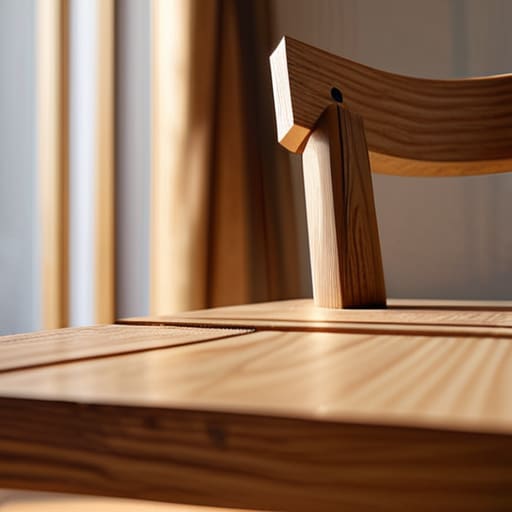
To me, quietness isn’t about the absence of sound, though that’s where most people start looking. In furniture, it’s about the absence of distraction. I often find myself staring at a joinery detail for hours, wondering if a visible screw or a slightly more aggressive taper will break the rhythm of the piece. True quietness comes from visual noise reduction—the discipline of removing anything that demands an explanation. If a user has to ask why a leg is shaped that way, or why a seam exists, you’ve already lost the silence.
It’s a delicate balancing act of intentional design choices. I remember a side table I built last year; I nearly added a brass inlay to “elevate” it, but I caught myself. That inlay would have been a shout in a room full of whispers. Instead, I leaned into the grain of the walnut, using negative space utilization to let the wood breathe. The goal isn’t to make something that disappears, but to make something that settles into a room without asking for permission to exist.
Key Things to Know
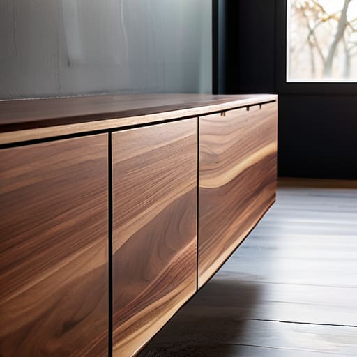
I’ve learned that quietness isn’t just the absence of sound; it’s the absence of visual clutter that begs for attention. When I was working on the joinery for my last sideboard, I found myself fighting the urge to add a decorative bevel. It felt like a “safe” design move, but in reality, it was just adding more to look at. True visual noise reduction comes from the discipline of knowing when to stop. You have to treat every line as a commitment rather than an option.
The real trick lies in how you handle the parts of the object that aren’t being used. I often think about negative space utilization as a physical material, much like oak or steel. If you don’t respect the gaps, the object becomes loud, even if it’s physically silent. It’s about making intentional design choices that allow the eye to rest. I keep a drawer full of failed leg profiles that were just a fraction too thick; they weren’t “bad” designs, they were just too loud for the room they were meant to inhabit.
Practical Tips and Steps
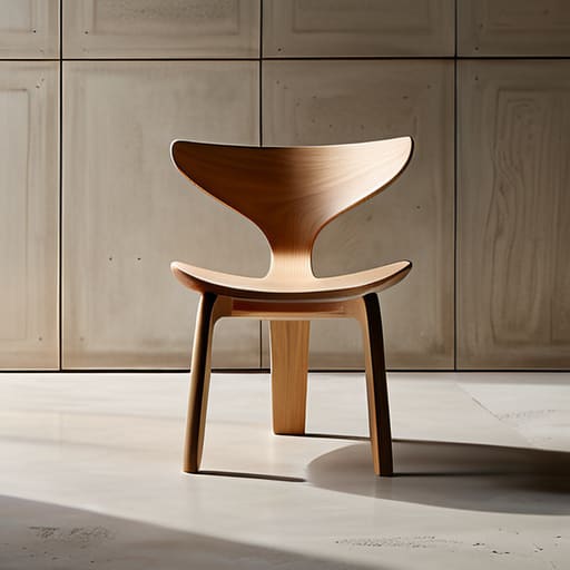
I’ve learned that silence in a physical object isn’t about what you add; it’s about the discipline of what you refuse to include. When I’m working on a new chair or a small desk accessory, I often find myself caught in the trap of adding a decorative chamfer or a subtle texture just because I can. But those little flourishes often end up being visual noise, breaking the calm I was trying to build. To combat this, I’ve started practicing a more aggressive form of negative space utilization. Instead of trying to fill a void, I treat the emptiness around a joint or a seam as a structural component itself. It’s about making sure the eye has a place to rest without being snagged by an unnecessary detail.
The real work happens during the prototyping phase, which is why my workshop is currently cluttered with “failures.” I often have a version of a piece that looks “better” in a traditional sense, but feels loud. I’ll pivot toward intentional design choices that might feel almost too plain at first glance. You have to be willing to sit with that discomfort—the feeling that you might have oversimplified—until you realize that the quietness isn’t a lack of character, but a presence of clarity.
Common Mistakes to Avoid
The biggest trap I see is the assumption that silence is synonymous with emptiness. I’ve seen too many designers fall into the hole of thinking that if they just strip everything away, they’ve achieved a quiet result. That isn’t design; it’s an absence. When you rely solely on minimalist aesthetic principles to do the heavy lifting, you often end up with something that feels sterile or, worse, unfinished. True quietness isn’t about having nothing to say; it’s about ensuring nothing is being shouted.
Another mistake is treating silence as a purely visual pursuit. We get so caught up in visual noise reduction—smoothing out a silhouette or hiding a seam—that we forget the object still has to exist in a physical, tactile world. If a chair looks serene but makes a sharp, plastic clack when you sit down, the illusion is shattered instantly. You can’t achieve understated elegance in design if the sensory experience is a series of unintentional interruptions. You have to design for the ears and the hands just as much as the eyes.
Final Thoughts
I often look back at the shelf in my studio—the graveyard of prototypes that didn’t make the cut—and realize that silence in design isn’t about what you add, but what you have the courage to strip away. It is easy to mistake a lack of features for quietness, but true stillness requires a rigorous discipline of intentional design choices. You aren’t just making something that doesn’t make noise; you are curating a sensory experience where nothing feels accidental or loud.
Ultimately, achieving that sense of understated elegance in design comes down to a constant negotiation with the ego. We want to leave our mark, to show how clever we were, but the most profound pieces are often those where the designer’s hand is felt through restraint rather than flourish. It is about finding that perfect balance of negative space utilization so that the object breathes rather than shouts. In the end, the most successful designs are the ones that allow the user to simply exist within them, undisturbed by the visual or tactile clutter we so often mistake for substance.
The Weight of the Unseen
We often mistake silence for the absence of noise, but in design, true quiet is the presence of restraint. It’s that moment in the studio when you realize that adding one more detail—one more polished edge or one more clever joinery trick—would actually break the stillness you’ve worked so hard to build.
Jonathan Marin
The Quiet After the Decision
Looking back at these principles, it’s easy to treat quiet design as a checklist of dampening materials or mechanical tolerances. But as we’ve discussed, true silence is rarely about adding more—it is almost always about the subtraction of friction. Whether you are managing the acoustic resonance of a chair leg or the subtle hum of a machine, the goal is to prevent the object from demanding attention. It comes down to those small, often invisible choices: the specific density of a felt pad, the way a joint is seated, or the decision to avoid a high-gloss finish that visually screams. When we get these things right, we aren’t just engineering a product; we are curating a sensory experience that allows the user to exist without interruption.
I often look at the piles of rejected prototypes in my studio—the ones that were too loud, too bright, or too demanding—and realize that silence is a hard-won victory. It is the result of a thousand tiny concessions made in favor of restraint. Designing something quiet is an exercise in humility because it requires you to work against your own impulse to be noticed. If you do your job well, the object disappears into the background of a life well-lived. Ultimately, the most profound success in design is when the user forgets the object is even there, leaving only the stillness you worked so hard to protect.
