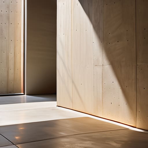
How Light Falls on a Surface
I spent three weeks in 2004 obsessing over the grain of a walnut sideboard, only to realize the piece looked utterly dead because I had treated the lighting as an afterthought. I had designed the object, but I hadn’t designed the environment it lived in. Most design manuals will tell you that illumination is about lumens and technical specifications, but they miss the point entirely. If you want to understand how to consider light in a design, you have to stop looking at light as a utility to prevent shadows and start seeing it as the final layer of material. It is the invisible finish that either highlights the soul of a piece or makes it look like a cheap imitation of itself.
I’m not here to sell you on expensive smart-home systems or complex architectural layering that requires a degree to operate. Instead, I want to talk about the tension between what we see and what we feel. I’ll share what I’ve learned from twenty years of making things—the mistakes I made in the studio and the decisions that nearly went the other way—to help you navigate the actual, messy reality of light. We’re going to look at how to use shadow as a tool, not a flaw, and how to find the balance between function and atmosphere.
The Near Miss How to Consider Light in a Design
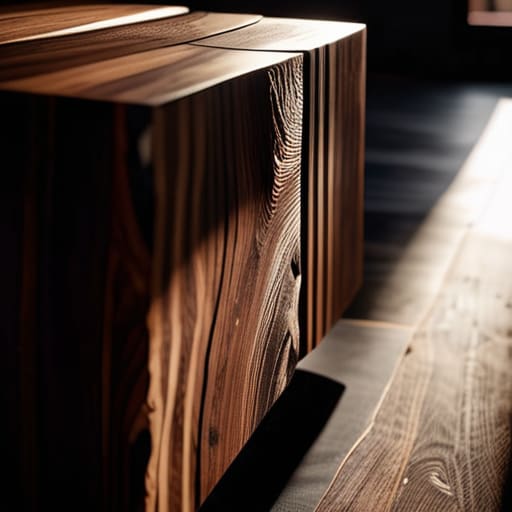
I have a shelf in the back of my studio dedicated to the “almosts.” There’s a chair leg carved with a taper so aggressive it felt unstable, and a joinery detail that looked more like a scar than a connection. When I approach lighting, I look for that same tension. Most people approach a room by trying to solve for visibility, but true design happens when you stop treating light as a utility and start treating it as a material. You aren’t just turning on a bulb; you are managing the way a surface reveals itself.
I often find myself caught between the safety of even illumination and the risk of something more dramatic. The mistake most make is settling for a flat, singular source that kills all sense of dimension. Instead, I try to build lighting layers for spatial depth, layering a soft wash against a sharp, intentional point of focus. It’s about finding the balance between ambient vs task lighting so that the room doesn’t just feel “lit,” but feels inhabited. You want to create those pockets of shadow where the eye can actually rest, rather than forcing it to scan a perfectly bright, lifeless void.
The Error of Uniformity Navigating Ambient vs Task Lighting
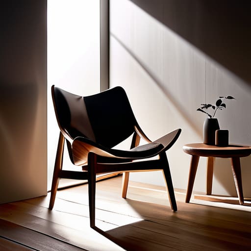
I have a shelf in the back of my studio dedicated to the “flat” failures—pieces where I obsessed over the silhouette but completely ignored how the light would hit the grain. They look perfect on a CAD screen, but in a room, they feel dead. This usually happens when a designer falls into the trap of trying to light everything at once, seeking a kind of democratic, even glow that actually ends up stripping a space of its soul. When you treat ambient vs task lighting as a binary choice rather than a conversation, you lose the ability to direct the eye.
A room shouldn’t feel like a brightly lit supermarket aisle; it should feel like a series of discoveries. To avoid that sterile, washed-out sensation, you have to embrace lighting layers for spatial depth. I’ve learned that the most successful environments are built on tension: a soft, low-level wash of light that defines the perimeter, interrupted by a sharp, intentional beam that tells you exactly where to sit, read, or linger. If everything is visible, nothing is important.
The Ghost of Color Temperature in Interior Design
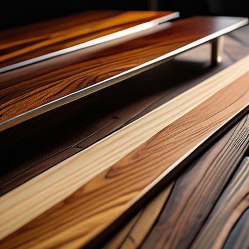
I have a shelf in my studio filled with wood samples—walnut, ash, white oak—all stained or finished differently. I keep them because I’ve learned that a material’s true character is a moving target, dictated largely by the Kelvin scale. You can pick the most exquisite, deep-toned mahogany, but if you bathe it in a clinical, blue-heavy light, you haven’t just changed the mood; you’ve fundamentally altered the material’s identity. This is the invisible weight of color temperature in interior design. It is the difference between a room that feels like a sanctuary and one that feels like a high-end dental clinic.
I often find myself obsessing over the tension between a warm, amber glow and the stark clarity of daylight. It’s not just about “coziness,” though that’s the shorthand people use. It’s about how light interacts with the grain and the finish to create visual texture and light interaction. If the temperature is too high, you lose the soul of the wood; if it’s too low, you lose the form. The goal isn’t to find a “perfect” bulb, but to find the one that honors the decisions you made when you were choosing the furniture itself.
The Lost Dimension Lighting Layers for Spatial Depth
I have a shelf in the back of my studio filled with chair legs that were too aggressive and joinery that felt too timid. They remind me that a design isn’t a single decision, but a series of negotiations. The same applies to a room. When we talk about lighting layers for spatial depth, we aren’t just talking about adding more lamps; we are talking about creating a sense of relief. A room lit only from the ceiling feels like a stage set—flat, clinical, and devoid of soul. It lacks the shadows necessary to tell the eye where one plane ends and another begins.
To find real dimension, you have to play with the friction between different light sources. It’s about the way a low-slung floor lamp interacts with the grain of a walnut table, or how a pinpoint accent light creates visual texture and light interaction against a rough plaster wall. You want to avoid that suffocating sense of total visibility. The goal is to guide the eye through a landscape of highlights and retreats, using light to sculpt the air itself rather than just illuminating the floor.
Chasing the Sun the Risk of Natural Light Optimization
There is a specific kind of arrogance that comes with designing for a space that faces south. We talk about natural light optimization as if it’s a mathematical certainty, a gift we can simply harness with the right glazing or a well-placed clerestory window. But I’ve spent too many afternoons in my studio watching a single, aggressive beam of sun turn a perfectly balanced room into a high-contrast battlefield. You think you’re inviting the outdoors in, but you’re actually inviting a variable you can’t control.
The danger lies in the way sunlight dictates visual texture and light interaction throughout the day. A chair that looks sculptural and muted at ten in the morning might look harsh and two-dimensional by two o’clock when the sun hits it at a direct angle. I’ve kept prototypes of side tables where the wood grain was beautiful under soft light, but became an eyesore under direct sun because the glare was too aggressive. We often forget that natural light isn’t a static utility; it’s a moving, breathing entity that can easily overwhelm the very layers we worked so hard to build.
The Surface Tension of Visual Texture and Light Interaction
I spent last Tuesday staring at a slab of walnut for a client’s sideboard, wondering why the grain looked so dead under the showroom lights. It wasn’t the wood; it was the way the light was hitting it. When we talk about visual texture and light interaction, we often forget that a surface isn’t just a plane—it’s a landscape of microscopic peaks and valleys. If your light source is too direct, you flatten the soul out of the material. You lose the very thing that makes a piece feel tactile and alive.
The real friction occurs in the gap between specular vs diffuse reflection. If you aim for a high-gloss finish, you’re essentially designing a mirror that fights the viewer for attention. But if you lean too hard into matte, you risk a certain visual heaviness. I’ve always found that the most successful pieces are those that allow light to “catch” on the edges. It’s about finding that sweet spot where the light doesn’t just strike the surface, but dwells on it for a moment before moving on.
Choosing the Glare Specular vs Diffuse Reflection
I have a shelf in the back of my studio dedicated to the “almosts”—the chair legs that were too thin, the joinery that failed under stress. Usually, those failures are structural, but sometimes they are optical. I spent three weeks on a walnut dining table last autumn, obsessing over a finish that felt too quiet. I was caught in the tug-of-war between specular vs diffuse reflection, trying to decide if the wood should mirror the room or simply absorb it.
A specular finish is a seductive trap; it offers that sharp, high-contrast glint that makes an object look expensive, but it can also feel aggressive, like a bright light hitting a mirror. On the other hand, a diffuse reflection softens everything, turning the surface into a matte, tactile landscape. I eventually settled on a hand-rubbed oil that sat somewhere in the middle. It wasn’t the perfect, mirror-like sheen the client originally requested, nor was it the flat, dead matte I initially feared. It was the compromise that allowed the grain to breathe without blinding anyone at dinner.
The Weight of the Shadow
We spend so much time obsessing over the lumens and the placement of the fixture that we forget light is only as interesting as the shadows it fails to erase. A well-lit room is a technical achievement, but a room with tension—one that knows when to retreat into a corner—is a design.
Jonathan Marin
The Weight of the Final Decision
We spend so much of our time trying to solve for the perfect, even illumination, but as we’ve walked through, the real work lies in the friction. It’s the tension between the task light and the ambient glow, the way a specific color temperature can either ground a room or make it feel clinical, and the precarious balance of how light hits a textured surface. Designing with light isn’t about finding a way to eliminate shadows; it’s about understanding that shadows are the structural integrity of a mood. If you try to smooth out every specular reflection or chase a sunbeam that doesn’t want to be caught, you end up with a space that is technically correct but entirely hollow.
In my studio, I have a shelf of failed joints and warped wood—pieces that lost the battle against gravity or material constraint. I look at them and realize that the success of my current work is built entirely on those specific, difficult choices. Lighting is no different. Don’t be afraid of the light that feels a bit too sharp or the corner that stays stubbornly dark. The most resonant spaces are rarely the ones that follow the manual; they are the ones where you had the courage to embrace the imperfection of the light you actually have. That is where the design finally starts to breathe.
