Designing for One Room
I spent three weeks in a drafty studio in coastal Maine last autumn, staring at a pile of reclaimed cedar and a set of sketches that felt entirely too “studio-made.” Everyone tells you that knowing how to design for a specific place is about studying topography or local flora, as if you can just copy-paste a landscape onto a chair leg. It’s a lie. Real site-specific design isn’t about mimicry; it’s about the friction between the material and the climate. I realized my initial concept was too delicate for the salt air—it was a beautiful idea that almost made it to the prototype stage, but the environment would have chewed it up in a season.
I’m not here to give you a lecture on aesthetic harmony or a checklist of regional motifs. Instead, I want to talk about the hard constraints that actually dictate a project’s soul. I’ll be sharing the messy, unpolished lessons I’ve learned from two decades of seeing what works and, more importantly, what fails when it meets the real world. We’re going to look at the near misses—those pivotal moments where a design either yields to its surroundings or stubbornly resists them.
The Ghost of the Site How to Design for a Specific Place
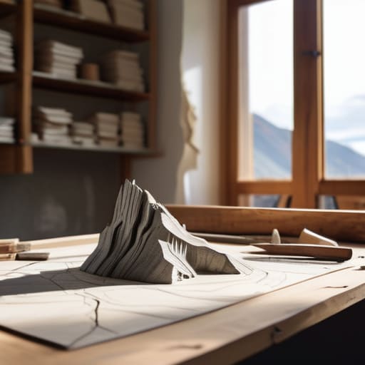
I have a shelf in my studio dedicated to the “almosts”—the chair legs that were too spindly, the joinery that felt dishonest. When I approach a new commission, I look for the site’s version of those mistakes. Designing for a location isn’t about a checklist of data; it’s about listening to what the ground is trying to tell you. You start with the heavy lifting of topography and site analysis, sure, but that’s just the skeleton. The real work begins when you stop trying to impose a shape onto the land and start looking for the friction points.
I’ve found that the most successful pieces—or buildings, if we’re thinking larger—emerge from a tension between the object and its surroundings. It’s about more than just climatic responsive design or keeping the wind out; it’s about how a shadow falls across a surface at 4:00 PM in November. You want to capture that specific, fleeting quality. If you aren’t constantly negotiating with the environment, you aren’t designing for a place; you’re just dropping a foreign object into a landscape that doesn’t want it.
Topography and Site Analysis the Lines We Almost Ignored
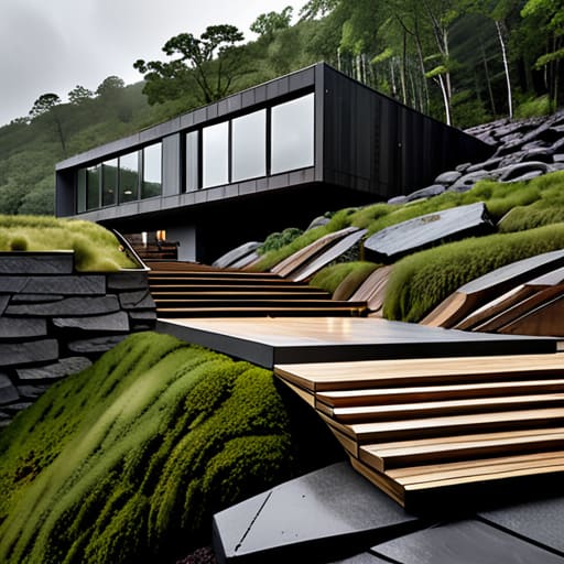
I remember a project in the foothills of the Catskills where I spent three days just staring at a slope, trying to figure out why my initial sketches felt so wrong. I had approached the site as a blank slate, a flat plane waiting for a structure, completely ignoring the subtle undulations of the earth. It wasn’t until I sat there through a heavy rain that I realized my mistake: I was fighting the land instead of listening to it. True topography and site analysis isn’t just about reading a contour map; it’s about understanding the way a slope dictates the flow of water and the weight of a foundation.
I almost pushed for a massive, leveled terrace to simplify the build, a decision that would have been easier for the contractors but would have severed the project from its roots. I chose instead to let the floorplates step down with the grade, a move that felt risky and expensive at the time. Looking back, that was the pivot. By embracing climatic responsive design and the natural tilt of the terrain, the house stopped feeling like an intruder and started feeling like an outgrowth of the hill itself.
Environmental Context in Architecture Finding the Necessary Tension

I remember a chair I prototyped for a client near the coast—a heavy, sand-colored oak piece that I thought was perfect. I had it tucked away in my “reject” pile for months because it felt too aggressive, too much like it was trying to conquer the dunes rather than sit within them. It wasn’t until I looked at my sketches again that I realized I hadn’t actually practiced climatic responsive design; I had just designed a beautiful object that ignored the salt air and the wind.
That’s the trap of environmental context in architecture, whether you’re building a house or a stool. We often mistake aesthetic harmony for functional integration. True landscape integration techniques aren’t about making a piece of furniture look like a rock or a tree; it’s about understanding how the light hits the floor at 4:00 PM in November and ensuring the material doesn’t fight the humidity. The best designs are those that exist in a state of necessary tension—they don’t vanish into the scenery, but they stop arguing with it.
Natural Light Optimization Strategies Chasing the Wrong Shadows
I spent three weeks on a prototype for a reading chair that was entirely dependent on a specific angle of afternoon light. I thought I had mastered the geometry, but I was actually just chasing a ghost. We often approach natural light optimization strategies as a mathematical problem—calculating lumens and solar paths like we’re balancing a ledger—but light isn’t a constant; it’s a performance. I remember a project where I pushed for these massive, floor-to-ceiling apertures to “bring the outside in,” only to realize I had ignored the brutal reality of the local glare. The room didn’t feel connected to the landscape; it felt exposed and restless.
The mistake was trying to force the light to behave rather than listening to how it actually moves across the terrain. When you integrate climatic responsive design, you aren’t just looking for brightness; you are looking for the way a shadow falls across a grain of wood at 4:00 PM in November. I almost missed the mark by treating light as a commodity to be captured, when it should be treated as a material to be sculpted. It’s in those moments of near-failure—when the light is too harsh or the shadows too shallow—that you finally understand the site’s true character.
Vernacular Design Principles the Beauty of Local Mistakes
I spent last Tuesday digging through a box of old joinery samples from a project in the high desert. There’s a specific kind of failure in those scraps—joints that were too delicate for the thermal expansion of the local stone, or wood species that fought the humidity of the valley. We often talk about vernacular design principles as if they are a set of sacred, inherited rules, but to me, they look more like a collection of hard-won corrections. The local builders didn’t use thick masonry walls because they were following a textbook; they did it because they had seen what happened to thin walls during a decade of sandstorms.
When I approach a new commission, I try to look for those same “mistakes.” It isn’t about mimicking a traditional aesthetic; it’s about understanding the climatic responsive design that was born out of necessity. I find myself constantly oscillating between the polished ideal and the rugged reality of what the site actually allows. Sometimes, the most honest way to honor a location is to embrace the very constraints that almost forced you to change your entire concept.
Climatic Responsive Design Negotiating With the Unyielding Elements
I have a drawer in my studio filled with failed joinery samples—pieces where I tried to force a material to behave against its nature. In furniture, we call it “fighting the grain,” but when you scale up to a building, you’re fighting the wind, the humidity, and the relentless thermal mass of the earth itself. Climatic responsive design isn’t about conquering these forces; it’s about a series of polite, often difficult, negotiations. I remember a project where we initially pushed for a massive glass expanse to capture the view, only to realize the afternoon sun would turn the interior into a kiln. We nearly committed to it, but the environmental context in architecture demanded we pivot toward deep, heavy overhangs instead.
It’s easy to look at a blueprint and see a static object, but a site is a living, breathing set of constraints. You realize that true success lies in the concessions you make to the weather. We ended up choosing a thermal mass that felt almost too heavy for the aesthetic we initially envisioned, but it was the only way to respect the local heat cycles. The design didn’t just sit on the land; it yielded to it.
Landscape Integration Techniques Where the Boundary Nearly Failed
I remember a cedar bench I designed for a client’s coastal garden—a project that sat on the edge of a limestone cliff. My initial instinct was to build something sculptural, a heavy, monolithic statement that stood apart from the rock. I spent weeks refining those heavy lines, only to realize during a site visit that the piece felt like an intruder. It was a classic case of ignoring the subtle landscape integration techniques that actually make a piece feel rooted. I ended up scrapping the heavy timber slab for a series of slim, articulated slats that mirrored the rhythm of the surrounding scrub.
The transition between the built object and the raw earth is where most designs lose their soul. We often treat the ground as a mere pedestal, but true integration happens when the object acknowledges the slope. I nearly missed the mark by trying to level the footprint, rather than letting the piece negotiate with the uneven terrain. It’s a delicate balance; you want the object to feel like it emerged from the topography and site analysis you performed months prior, rather than something simply dropped from a truck.
The Weight of the Site
Designing for a place isn’t about mirroring its scenery; it’s about the friction of making a choice that feels inevitable only because you fought so hard against the site’s actual temperament.
Jonathan Marin
The Final Iteration
Looking back through the layers of this process—from the way the light hits a specific corner to the stubborn reality of the local slope—it becomes clear that designing for a place isn’t about a checklist of environmental factors. It is about the messy, often frustrating negotiation between what we want to build and what the land refuses to let us. We’ve talked about topography, climate, and the vernacular, but the common thread is the constant tension of the compromise. We find our best work not in the seamless integration we initially imagined, but in those moments where we had to pivot because the site simply wouldn’t cooperate. It is in the near-misses and the forced adjustments that the design finally stops being an imposition and starts being a conversation.
In my own studio, I have a shelf of failed joints and awkward legs—prototypes that looked perfect on paper but failed the reality of gravity or grain. I think of site-specific design in much the same way. You don’t arrive at a solution by imposing your will on a landscape; you arrive by listening to its constraints until they become your own. The goal isn’t to create something that stands against its surroundings, but something that feels as though it was inevitable. When you finally stop fighting the site and start designing with its specific, stubborn limitations, that is when the object truly finds its soul.
